
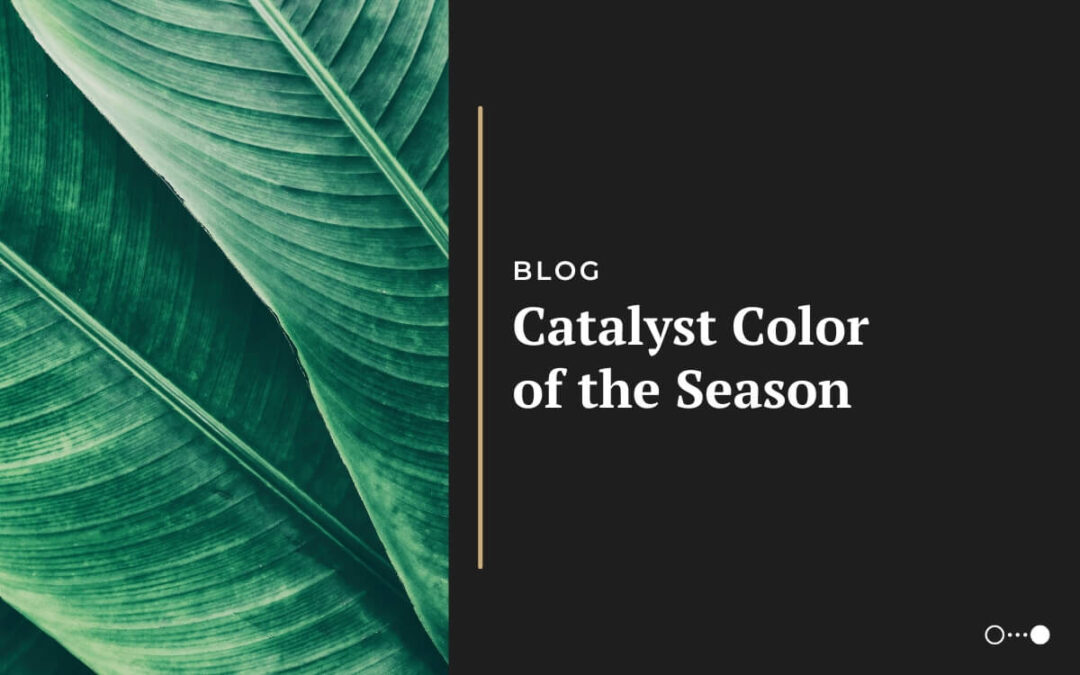
The Future Is Green
The end of the year is a time full of anticipation for interior designers, marketers, creatives, and brands alike. On the heels of trend predictions and fresh ideas for the upcoming year, many wait with bated breath for the release of the Color of the Year from top-rated paint companies and, of course, Pantone. Though these color selections can be highly debated (and somewhat polarizing), they’ve consistently been proven to set the tone for trends in fashion, graphic design, merchandise, and more.
The 2023 Colors of the Year spanned a wide range of shades — from off-white to a bright raspberry red. Perhaps the most notable color was Pantone’s Viva Magenta, described on the announcement page as “brave and fearless, and a pulsating color whose exuberance promotes a joyous and optimistic celebration, writing a new narrative.” On the heels of Pantone’s 2022 selection Veri Peri, Viva Magenta carries the same energy and future-focused feel (including nods to the Metaverse) into 2023.
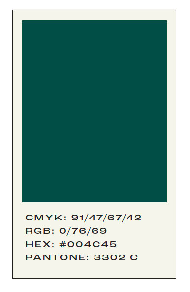
At Catalyst, we’ve begun making trend research a key part of our marketing strategy and, as a result, are unveiling our introductory Color of the Season. Enter The Future Is Green — a deep green/teal shade inspired by nature, growth, and well-being. Much like the excitement built by Pantone each year, the color green is full of
hope and anticipation (think of phrases such as “the grass is greener” or “greener pastures”). This deep green shade is in the same jewel-toned family as Viva Magenta but is approachable enough to be woven into real-life spaces and tangible elements. Biophilic design, for example, was a huge push in 2021 that encouraged companies to infuse their workspaces with greenery and light.
Shades of green have been increasing in popularity since 2020, including brighter shades such as Lime Nouveau and Neo Mint. The digital undertones of Gen Z green are now surpassing the iconic Millennial Pink due to its fresh look and gender-neutral feel.
As Allure says, “Gen Z green isn’t the green of BP, or Hulu, or Excel. It runs a much shorter spectrum, from Emerald City spires to Caribbean tide
pools.” Helen Steed, a creative director who works on consumer brands, told Allure, “I know it sounds cheesy, but it feels fresh and alive. And it’s natural. But the trends today are these hyped-up versions of what you would find in nature.”
Stay tuned to see our Color of the Season in action in the coming months! If you’d like to use this shade for yourself, we’ve included the color codes above.