MULTIFAMILY
The Shiloh Branding
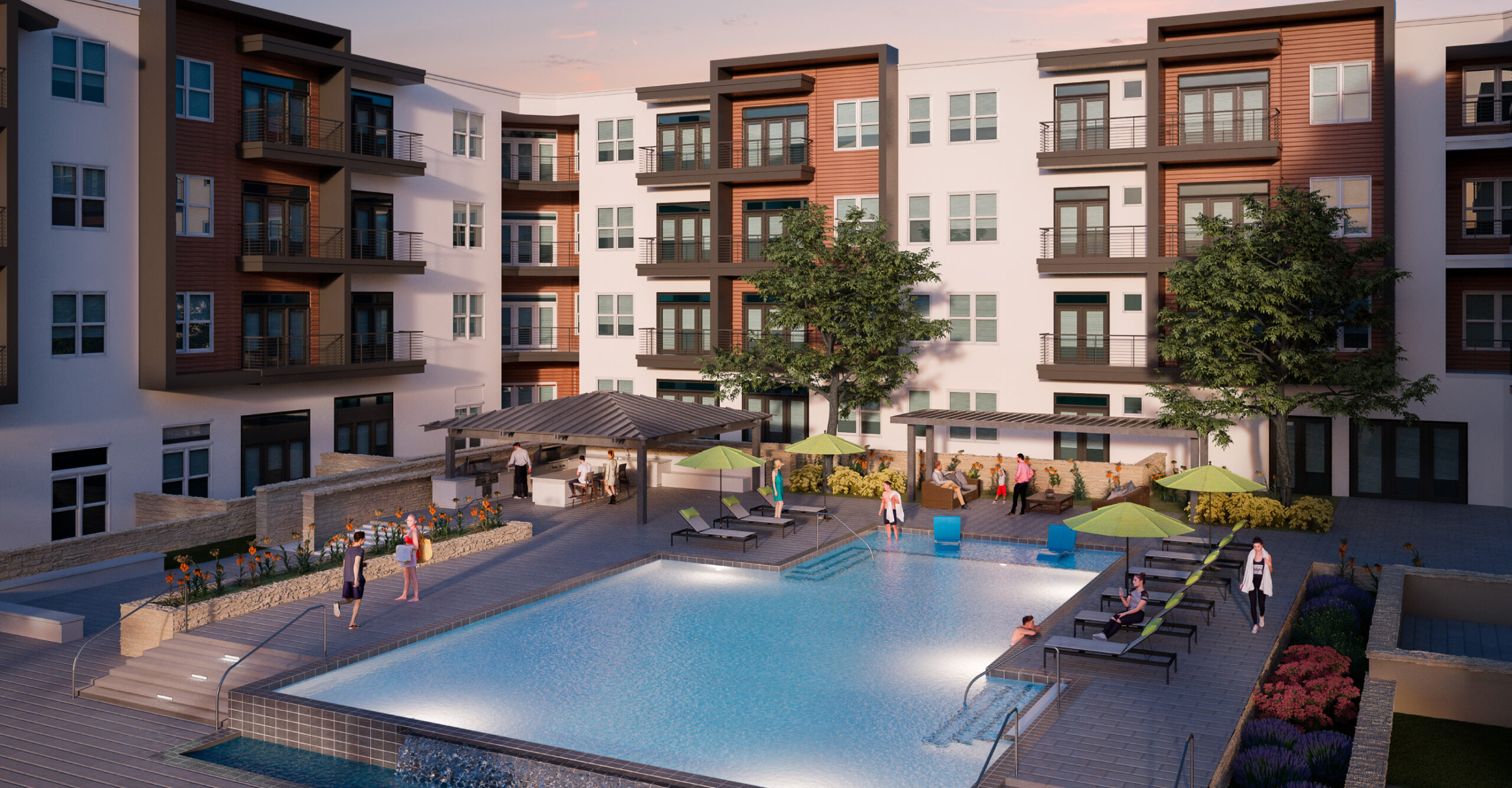
Slate Real Estate Partners was developing a brand-new 268-unit multifamily community in south Austin that was in need of branding to appeal to the market demographic, as well as differentiate the community from its surrounding competitors. The community was set for a spring 2021 opening and was in need of a brand identity, marketing materials, a website, and signage to support pre-leasing efforts.
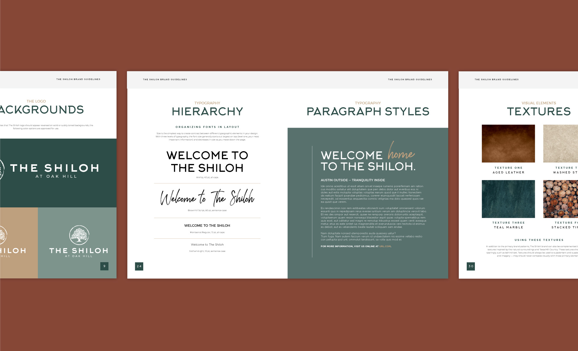
Catalyst proposed the name “The Shiloh” as a nod to the Oak Hill neighborhood’s origin, while also lending a personal touch. The brand itself took on a clean, minimal feel, with a color palette of greens, browns, and neutral tones that reflected the interior design and secluded location. A subsequent 40-page brand book was developed to build out the brand identity — including patterns, textures, typography, secondary colors, and a selection of stock images that represented the target demographic.
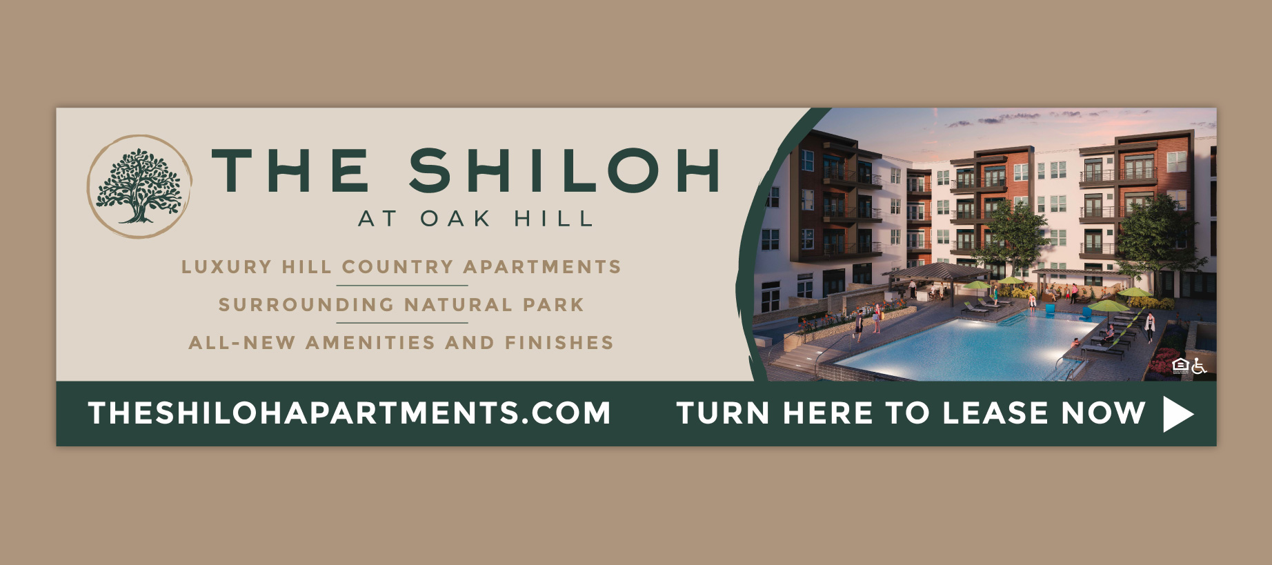
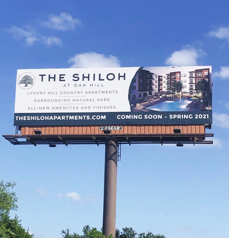
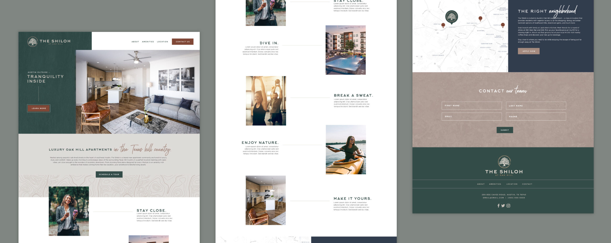
To begin brand awareness immediately, Catalyst developed a temporary website showcasing all of The Shilohs unique selling points, floor plans, and nearby hot spots, as well as a VIP contact list for exclusive updates. Additionally, a billboard design was created to reveal the name, URL, and “coming soon” date. These billboards were placed on two major highways adjacent to the property’s location in an effort to maximize exposure in the market.
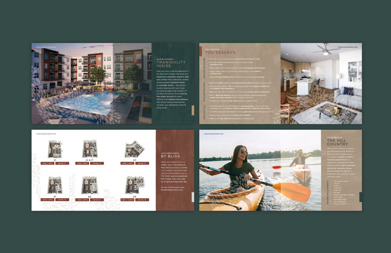
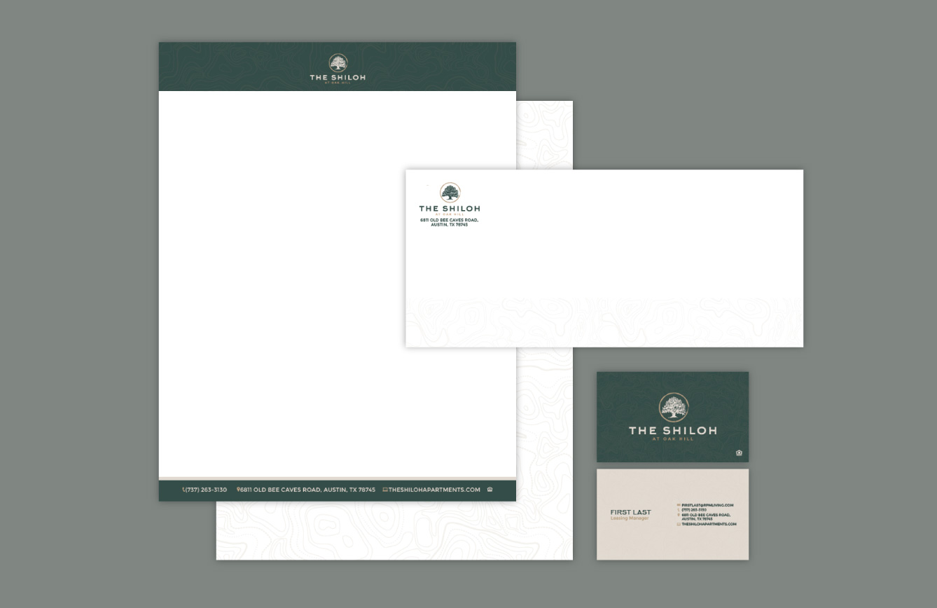
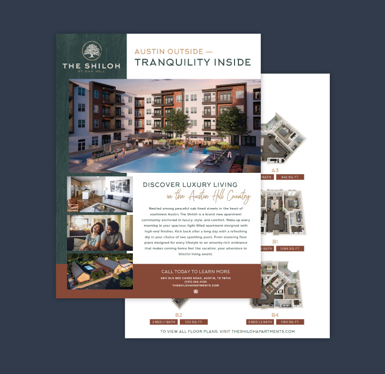
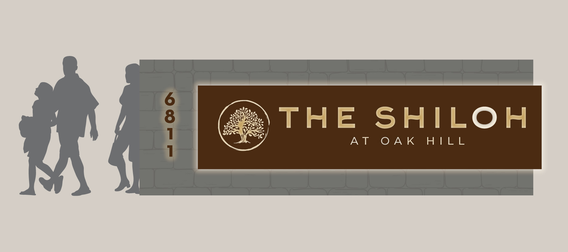
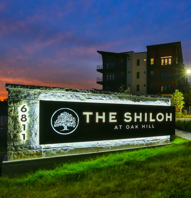
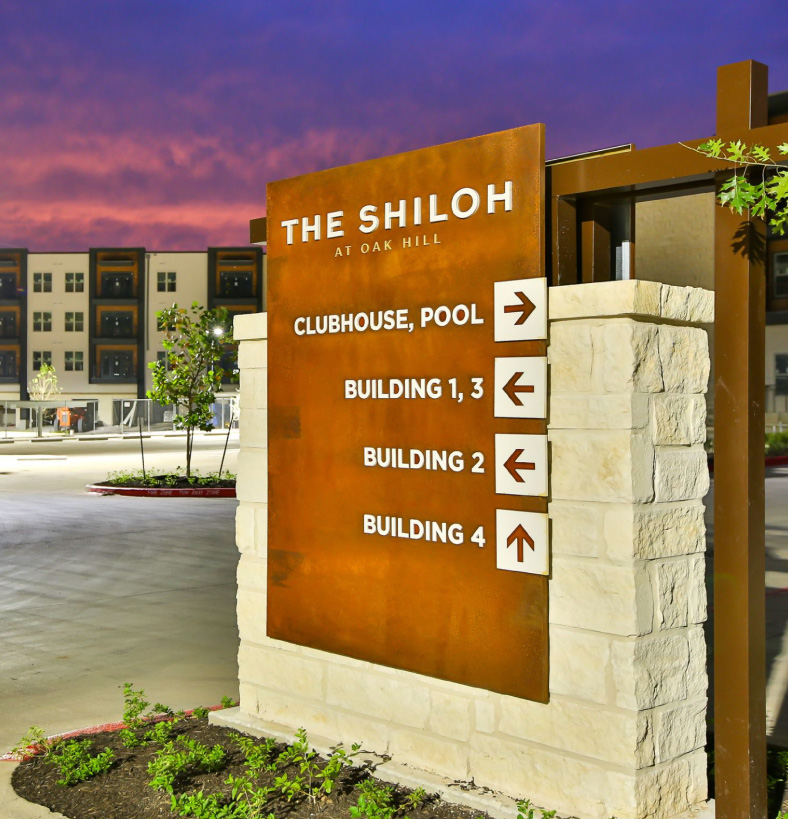
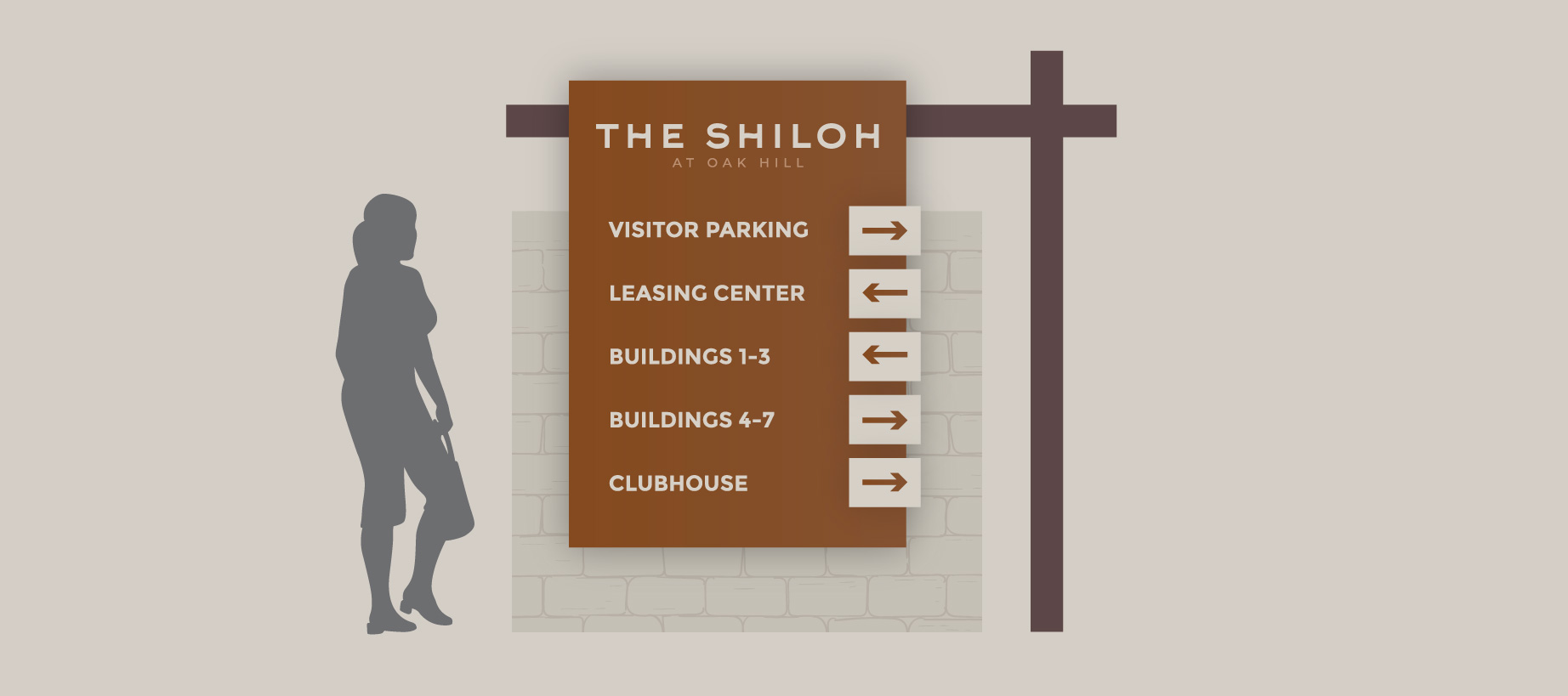
As construction progressed, the Catalyst team designed a suite of traditional print collateral for the leasing team. This included a sales sheet, a paper system, floor plan sheets, community flier, site map, and 12-page brochure, all utilizing The Shiloh’s new brand and consistent in their look and feel. On the ground, design and development of custom signage also took place — including a monument sign; building, unit, and amenity labels; and other wayfinding.
RESULTS
-
2021 Silver Davey Award – Design & Print Collateral
- 2021 Communicator Award – Design Features – Overall Design for Marketing / Promotion

