CORPORATE
Solidago Residential Branding
In June of 2020, Catalyst was contracted by LDG Development to create an identity for their new property management branch. LDG, one of the nation’s largest developers, owners, and managers of affordable housing, was looking to expand into management services for its existing portfolio of multifamily communities across the state of Texas. The brand needed to serve as an extension of the existing corporate brand, while also being robust enough to stand on its own against similar competitors.
After completing an in-depth initial discovery, the Catalyst team presented several name concepts to the LDG team, including the final selection: Solidago. Solidagos, or goldenrods, are the state flower of Kentucky, where LDG is headquartered. These bright yellow flowers symbolize encouragement, growth, and determination, all of which were core values of the corporate brand. As an added bonus, this name also included the letters L, D, and G.
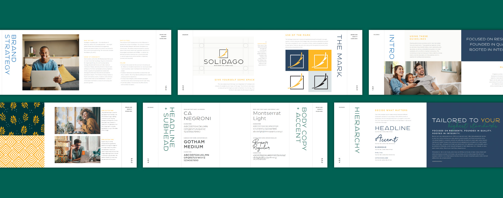
Once the name was finalized and vetted, Catalyst created a modern logo that blended a goldenrod branch with a modern line treatment and sans-serif font. From there, a full brand book was developed with additional colors, typography choices, custom patterns, and eye-catching textures. A selection of stock imagery was also curated, spanning from corporate team members to families and residents.
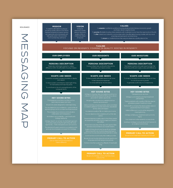
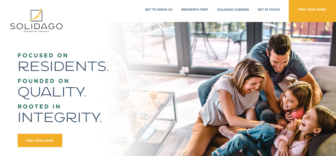
To aid the Solidago team in establishing a consistent brand voice across their new company (and all communities), Catalyst also provided a one-page messaging map. This document laid out key information such as the mission, vision, core values, and new tagline (“Focused on Residents. Founded in Quality. Rooted in Integrity.”); from there, it provided descriptions, soundbites, and calls to action for Solidago’s three key audiences: employees, residents, and investors. This piece was instrumental for both the on-site teams as well as Catalyst, as development began on the final piece: the custom website.
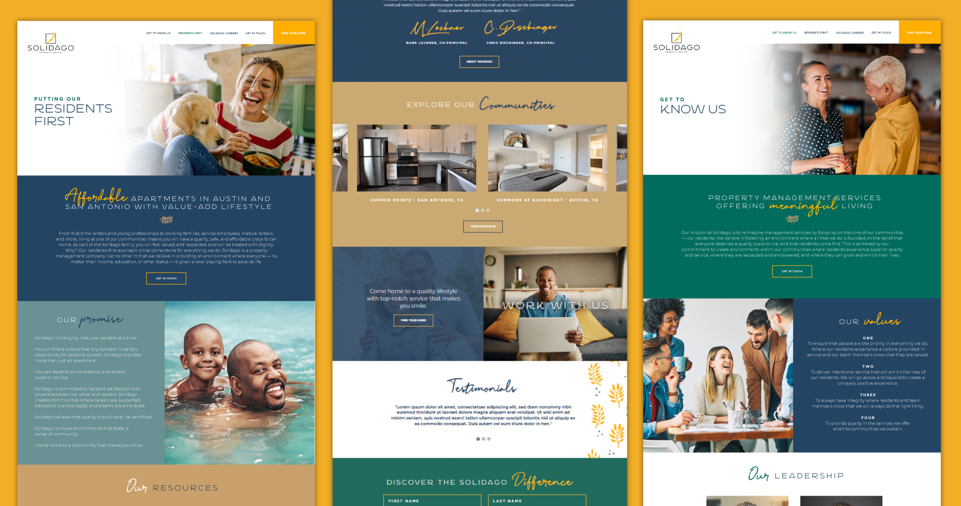
Solidago’s full website merged their new brand visuals with custom copy and unique layouts, making it a dynamic experience for all visitors. A simple navigation directed users to the most important information: their approach, job opportunities, portfolio, and a way to contact the team. The site also included personal elements such as testimonials, a “team member of the month” spotlight, an Instagram feed, and a database of city, state, and federal resources for each community. These unique touches continued to position Solidago as a “resident-first” company in all they do.
RESULTS
-
2021 Communicator Award — Corporate Identity Campaign- Identity Program Campaign for Corporate Communications
