CORPORATE
Birchstone Residential Branding
In fall 2020, Catalyst was approached by Ashcroft Capital, a New York-based multifamily investment firm, to help establish a brand for a new management company they were starting as part of their acquisition plan. The company already had a name — Birchstone Residential — but needed in-depth discovery and branding to finalize the rest of the identity.
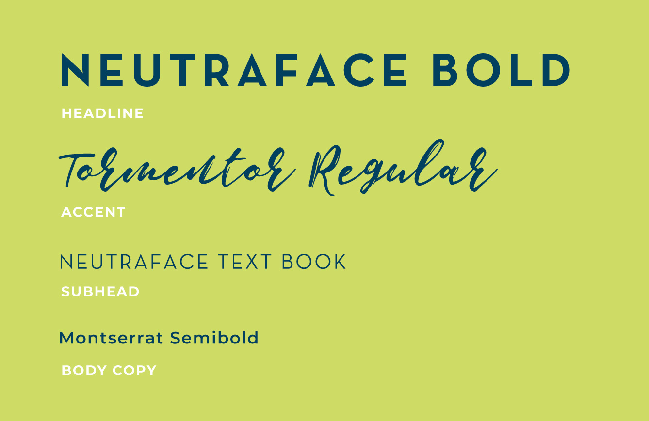
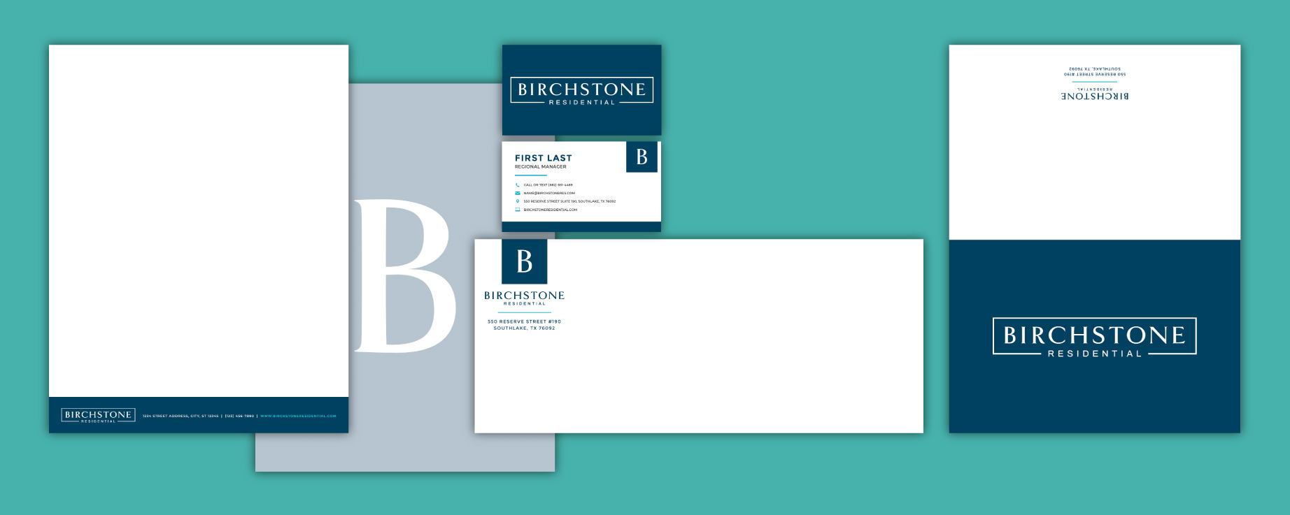
Catalyst’s primary goal during the branding process was to strike a delicate balance between professional and personable. The logo — a simple serif font encased in an open rectangle — infused elements of both traditional and modern design; this same idea carried to other elements of the brand, including the typography and color palette. During the discovery process, it was shown that the majority of multifamily property management companies stick to color palettes of blues, grays, and neutrals; Birchstone broke that mold by incorporating fun patterns, a handwritten script font, and vibrant accent colors of purple, lime, orange, teal, and pink. One everything was finalized, the Catalyst team compiled these brand elements into a comprehensive brand book.
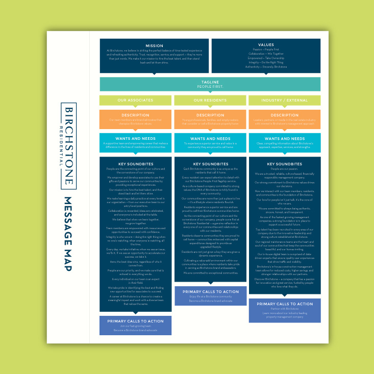
For the Birchstone team, messaging was just as important as visuals when it came to their brand standards. Catalyst designed a comprehensive message map PDF that leveraged Ashcroft Capital’s years of expertise into sharply written soundbites. The document included the company’s mission, values, and tagline for easy reference; it also outlined key audiences and their corresponding wants, needs, and calls to action. As Birchstone began to expand, this deliverable could serve as an instrumental piece in training new hires and understanding company culture.
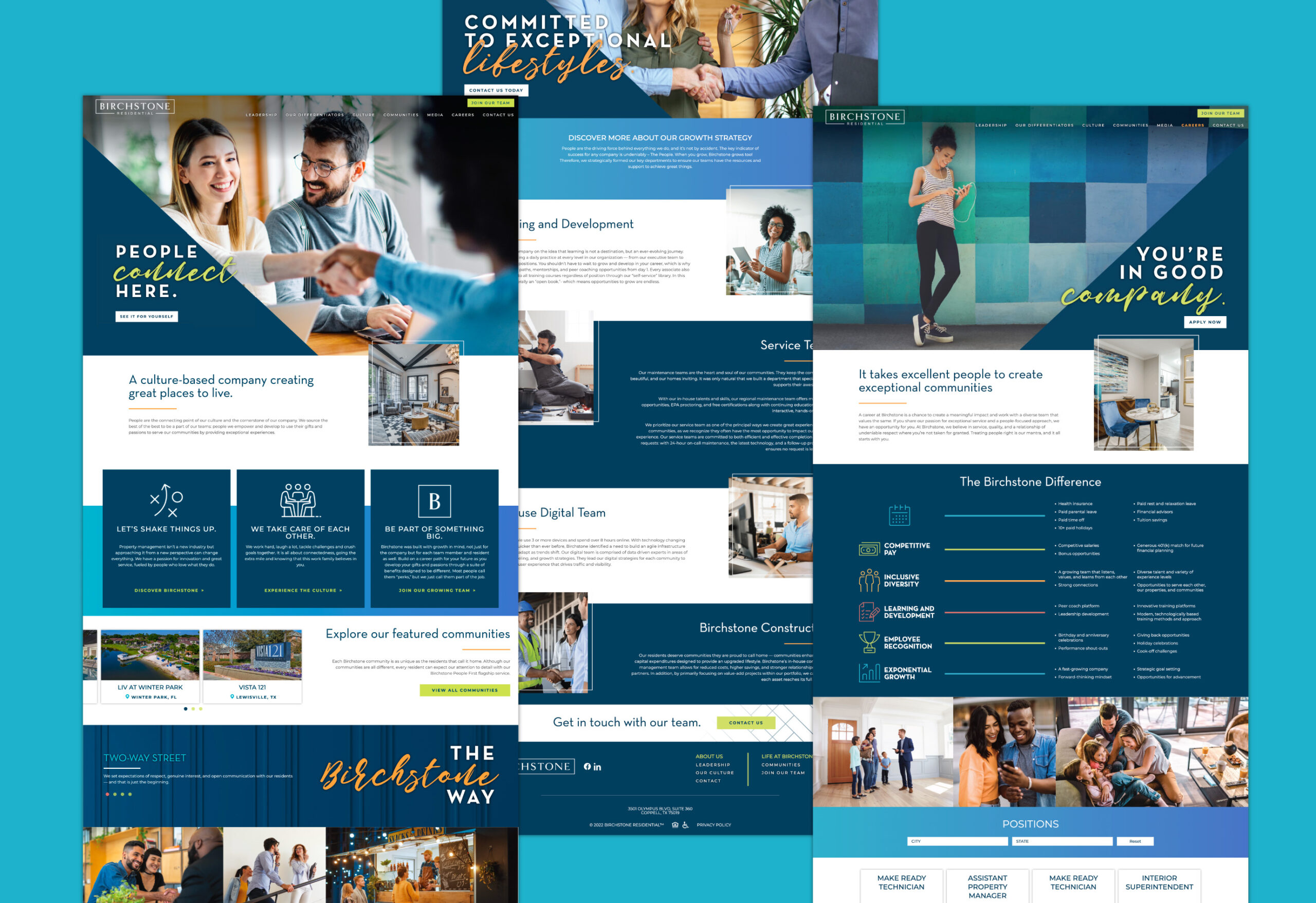
Once the Birchstone identity was established, Catalyst quickly got to work on a custom website design. Similar to the branding look and feel, the site needed to include traditional elements, clean navigation, and key information — while also capturing their unique culture and people-driven approach. The website features custom copywriting (based on the soundbites established in the message map) and includes a leadership page, culture page, blog, community portfolio, career page, and more. Eye-catching imagery and phrases such as “People connect here” and “Be part of a great story” give visitors an immediate sense of Birchstone’s dedication to their residents and team members.
As Birchstone grows their portfolio across the nation, Catalyst continues to provide ongoing optimizations, digital services, and strategic marketing efforts.

