
Catalyst was engaged to complete a rebranding of Yacht Harbor Club, a 173-unit multifamily property located on Hayden Island in Portland, Oregon. The property was a new development facing low occupancy numbers due to location, resident dissatisfaction, and a lack of a strong marketing strategy and focus.
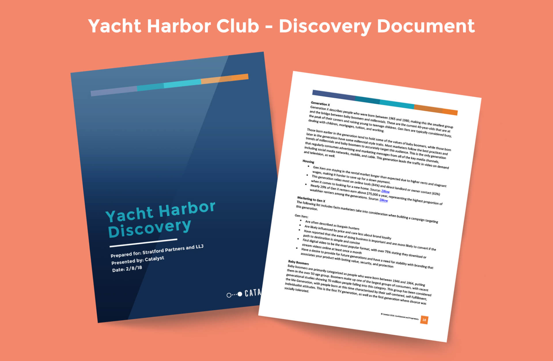
Catalyst started the engagement with a market research project to verify target audiences, determine additional marketing opportunities, and provide a marketing plan for a 12-month timeframe focused on building traffic and building trust with current residents to increase retention.
Research revealed two very distinct audiences: young professionals ranging in age from older millennials to younger Gen Xers who are married (double income, no kids), and empty nesters who range in age from older Gen Xers to baby boomers in need of downsizing. The brand would need to cater to both audiences, while still appearing unified in voice and visuals.
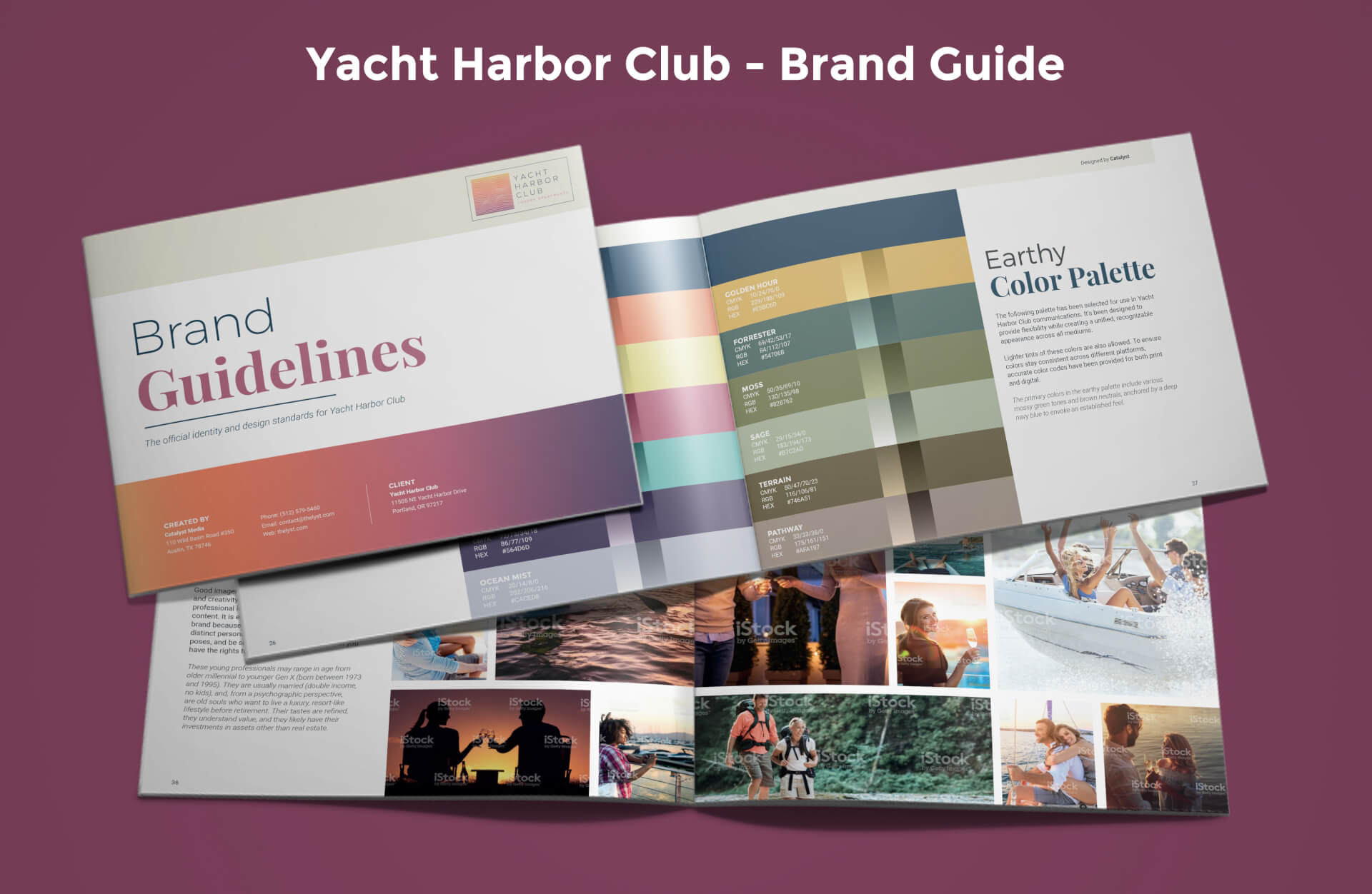
A new, more modern logo was designed, incorporating thin wave lines contrasted by a classic square lockup. For simplicity, the name was shortened to “Yacht Harbor Club” in messaging; however, it was paired with the descriptor “Luxury Apartments” in the logo so that the product was clearly identifiable. A full color palette was also developed for the brand, with a brighter half inspired by sunset tones and an earthy half inspired by the Pacific Northwest. Although each half of the spectrum was designed to appeal to a specific audience, the full Yacht Harbor Club color palette can also be joined together to create a cohesive look and feel. Brand patterns, textures, fonts, and stock imagery were also selected to round out the brand. Finally, everything was included in a comprehensive brand guidelines book to ensure consistency in the future. A detailed messaging map was also created to clearly define the target audiences and how the property should be highlighted to each for strong response.
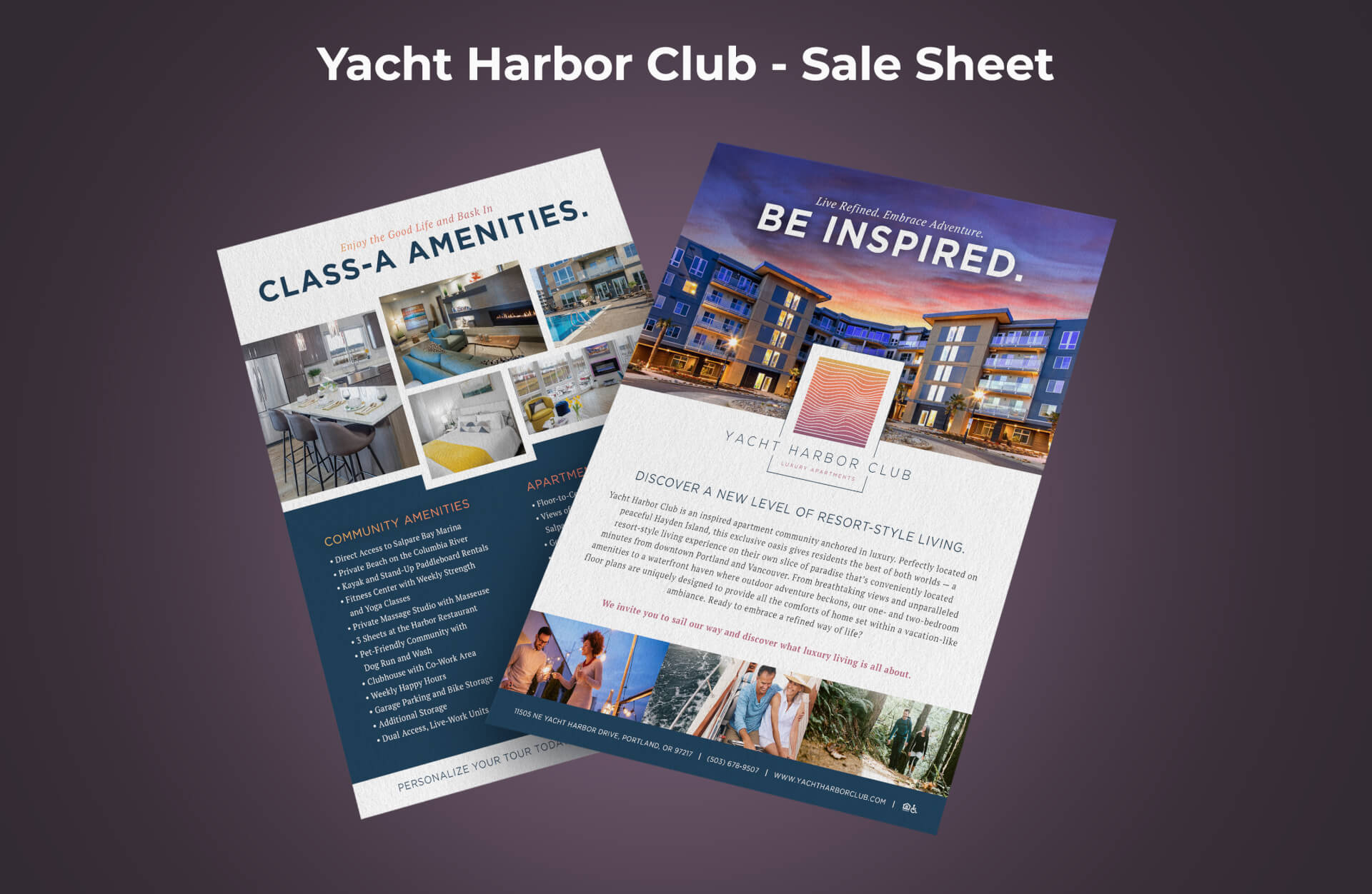

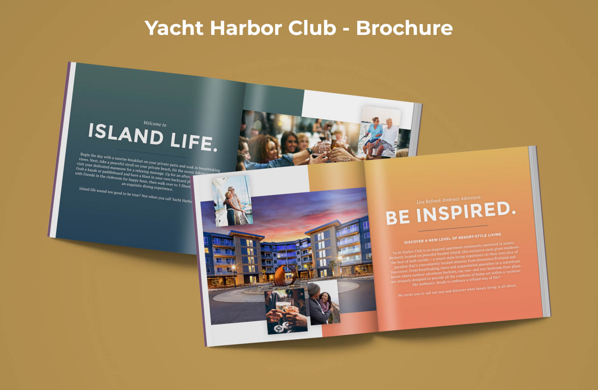

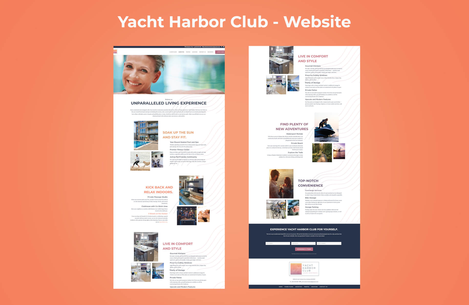
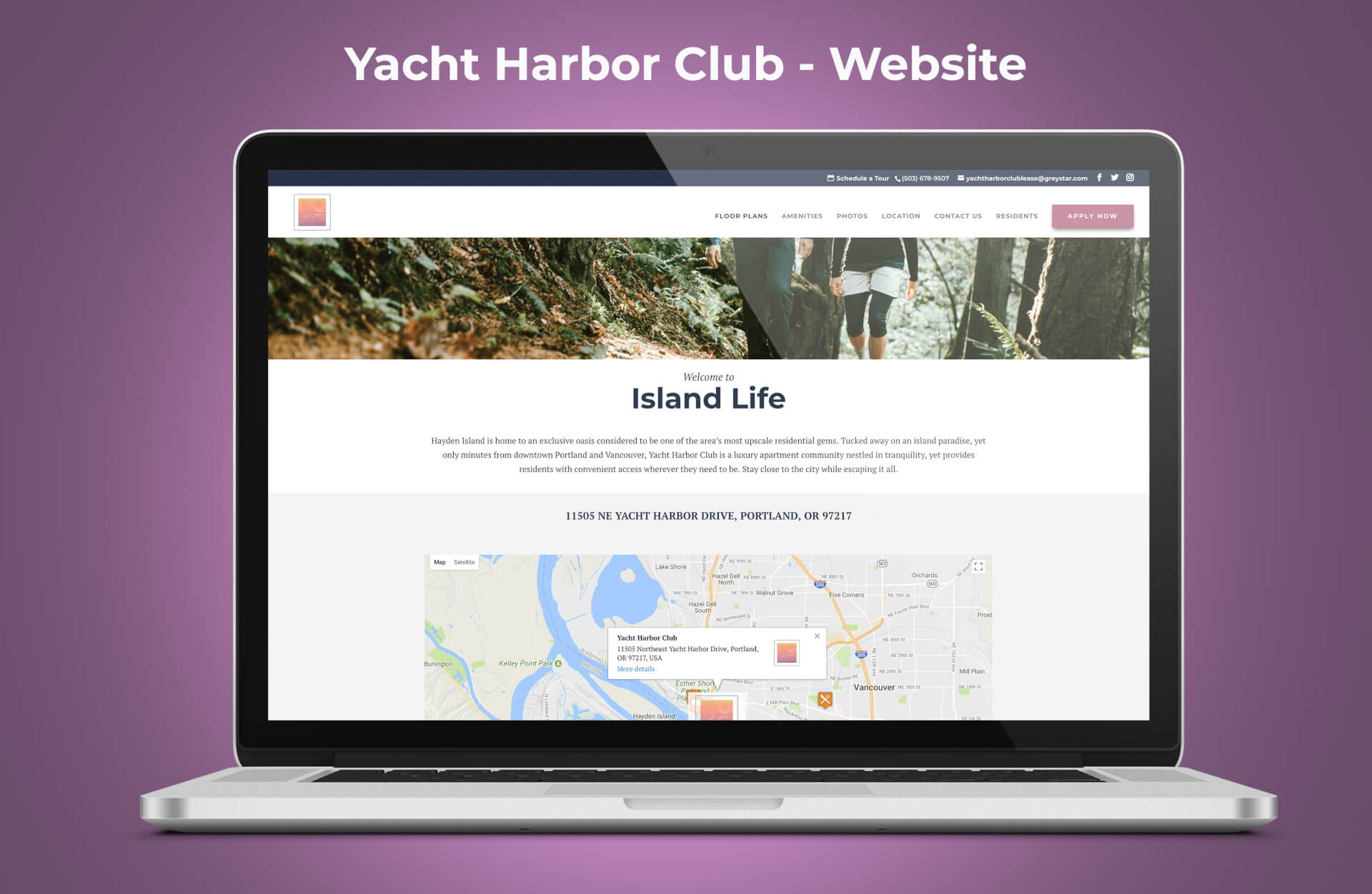
Catalyst then initiated a website redesign, a full suite of marketing materials, integrated marketing campaigns, and paid ad placement campaigns to target the audiences identified. On the property front, Catalyst worked with leasing operations to ensure a good workflow between marketing and leasing. The Catalyst team also led the strategy and creative implementation for a launch event, resulting in a new foundation for residents and prospects.
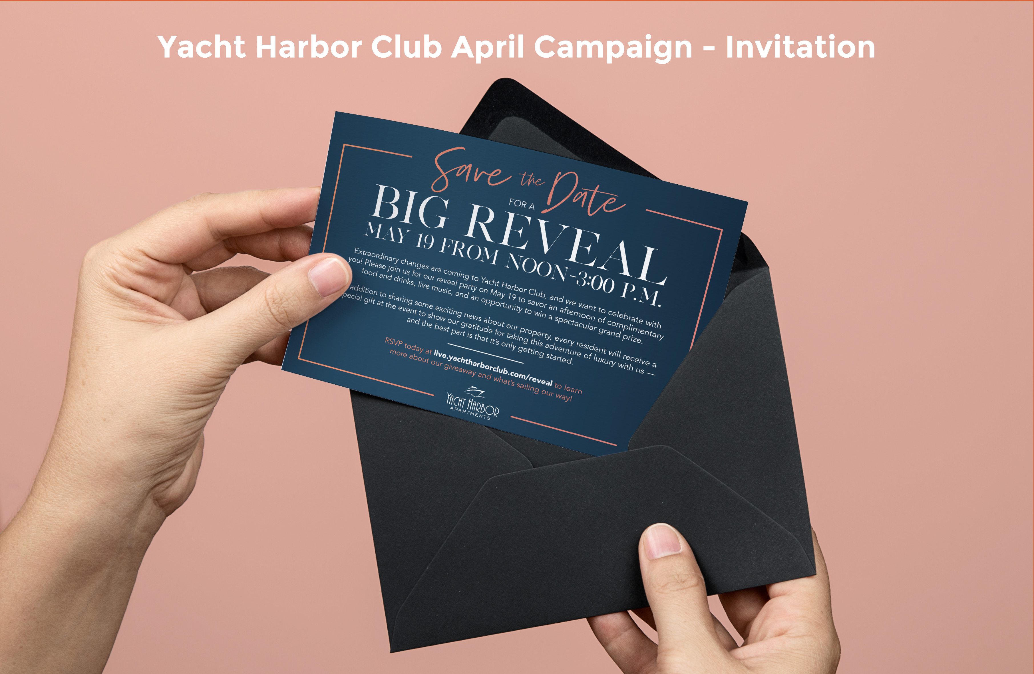
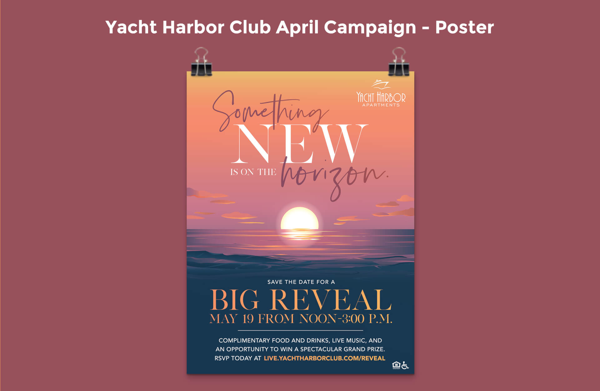


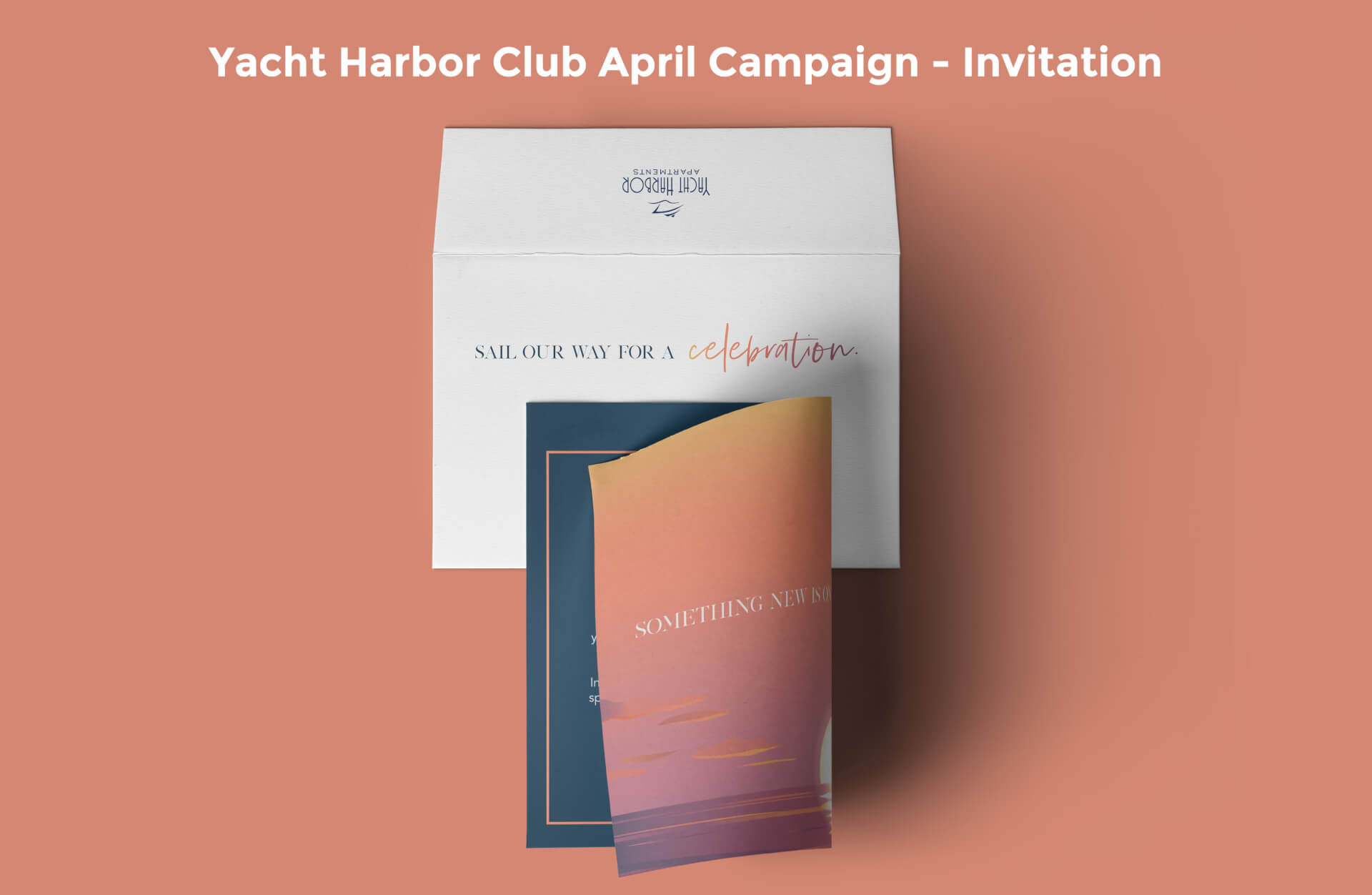
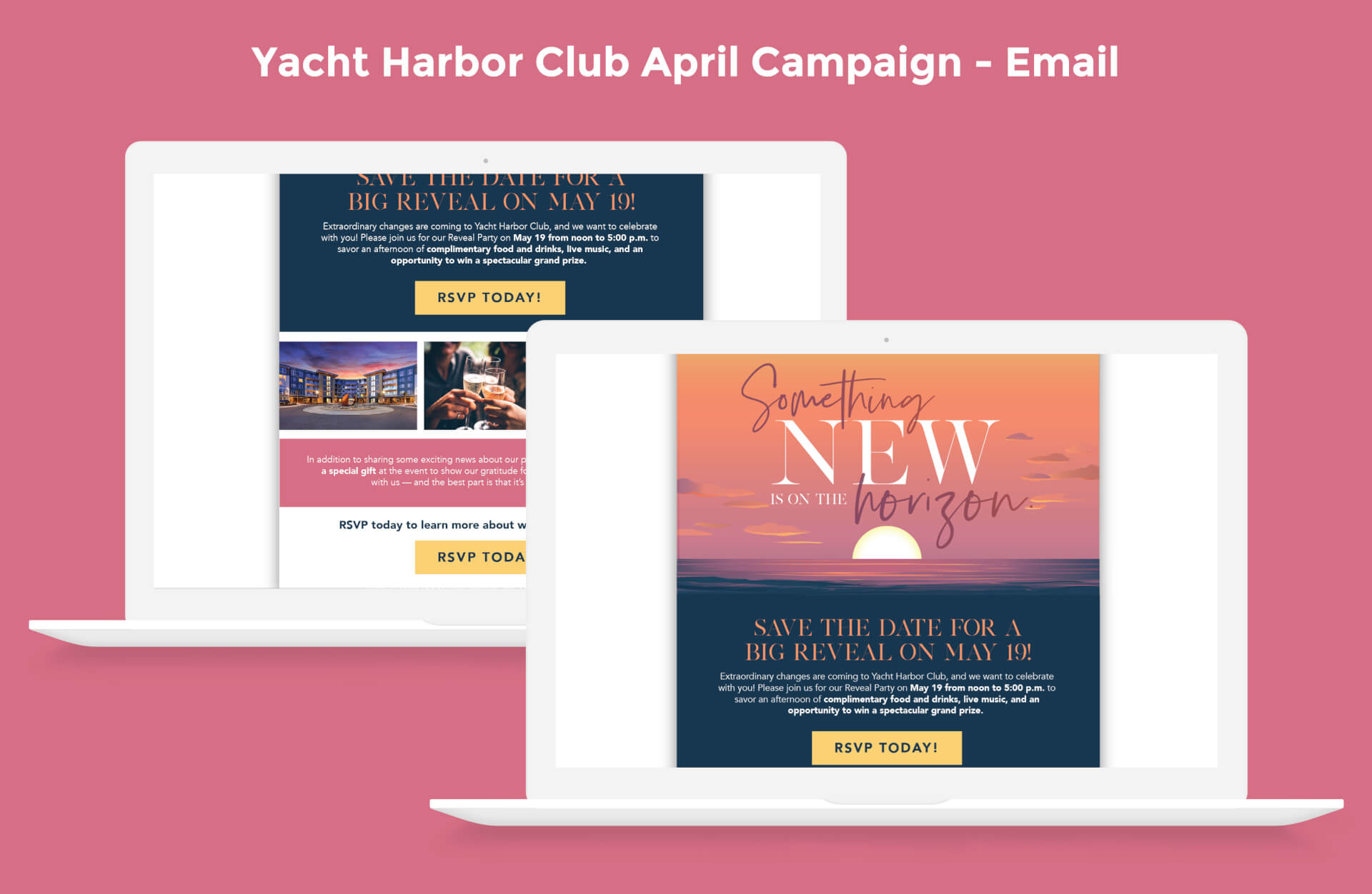
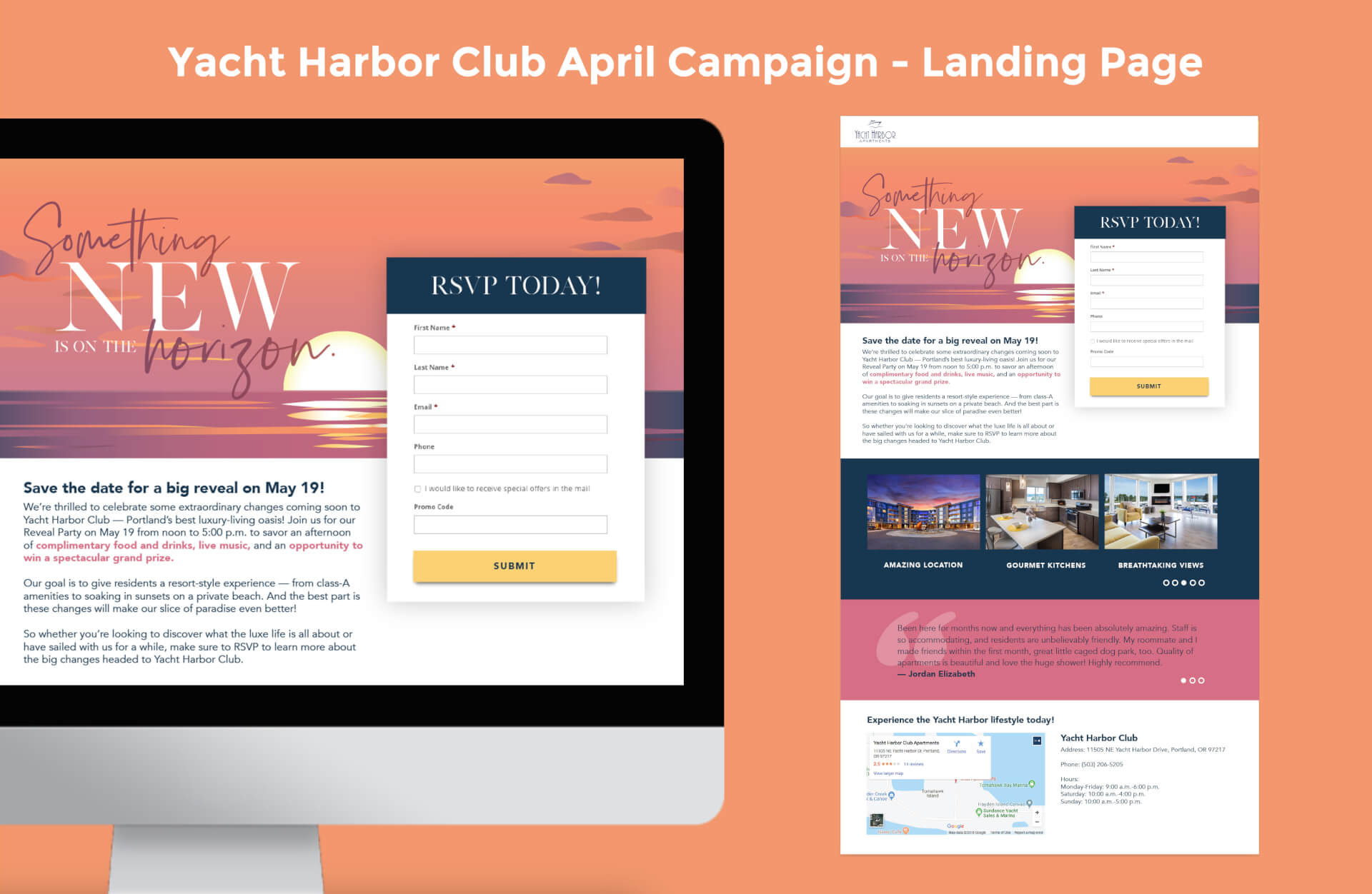
To reveal its new brand, Catalyst worked with Yacht Harbor Club to organize an on-site brand reveal party held on May 19, 2018. The event served as a forum in which prospective residents were able to interact with current residents and management, discuss upcoming capital improvements, and take tours of the property. In order to generate buzz around the event, Catalyst produced invitations with branded envelopes, a poster, social media ads, email blasts, and an RSVP landing page — all indicating the brand changes to come. The brand reveal campaign generated a total of 148 leads, with 79 leads coming from emails, and an estimated turnout of a little more than 100 attendees. The event proved to be a great success — awareness and excitement were generated about the brand reveal party and the property’s new identity, four people who attended signed a lease, and a number of prospects were interested in more information for future consideration.
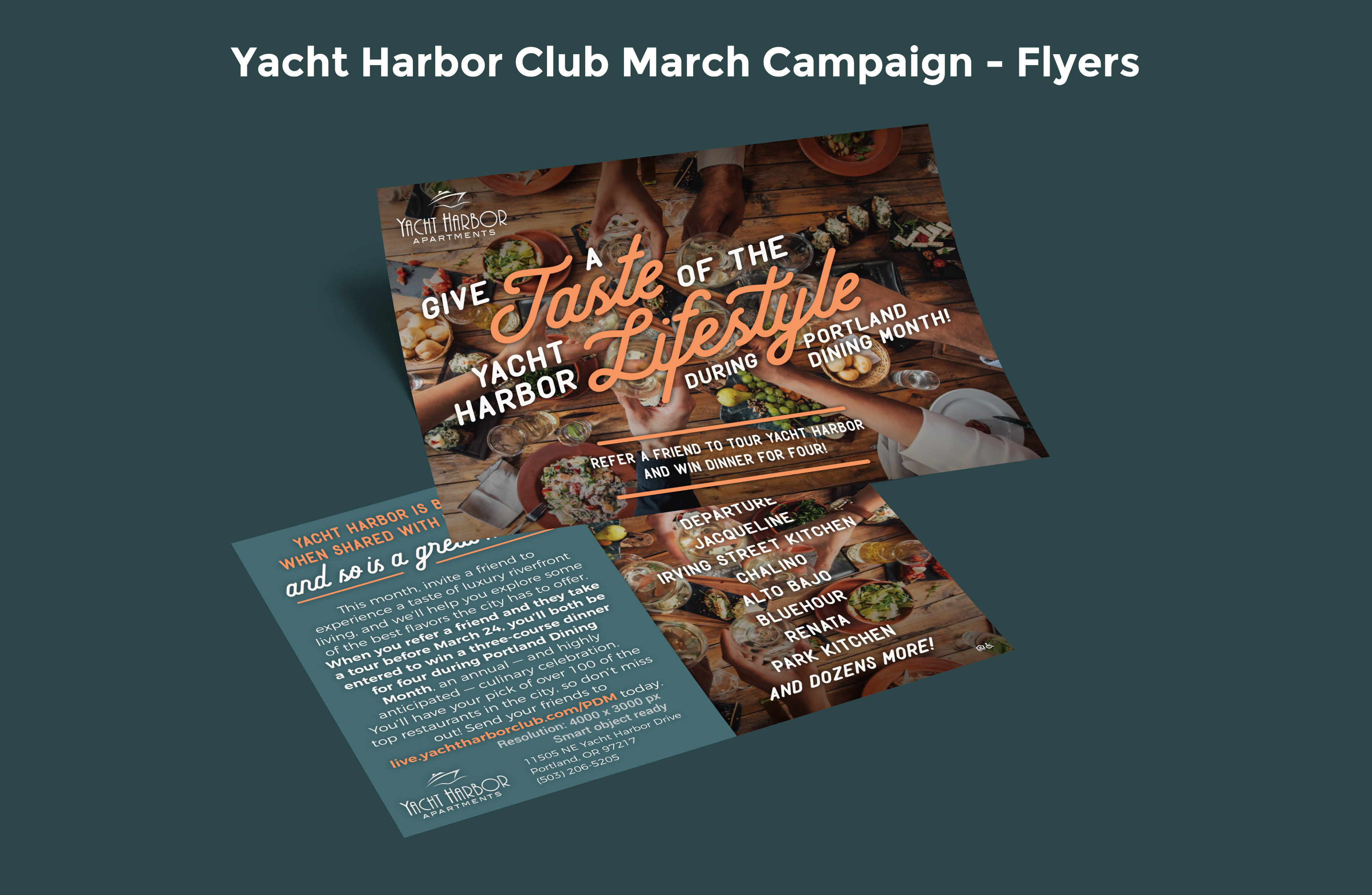
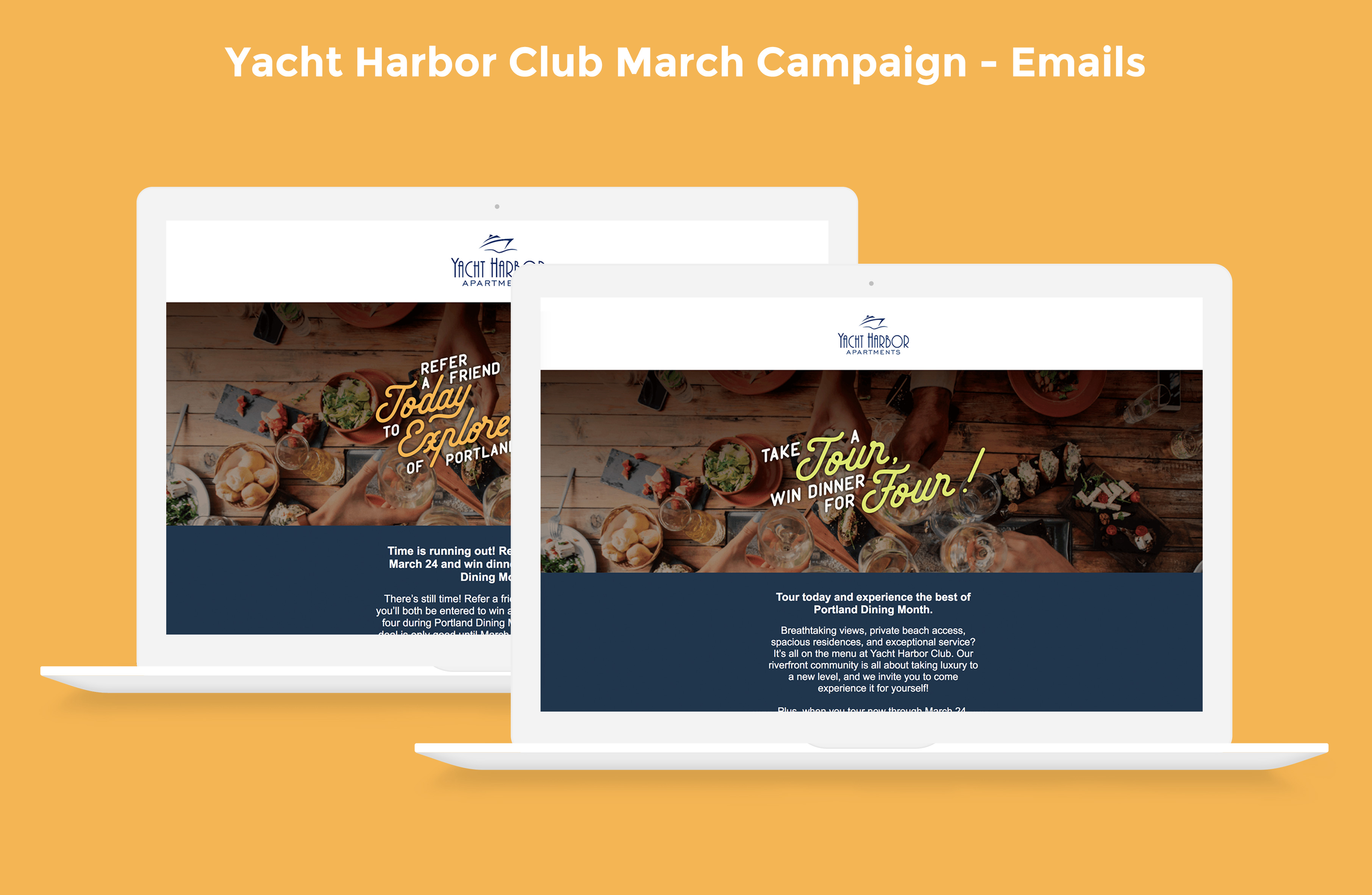
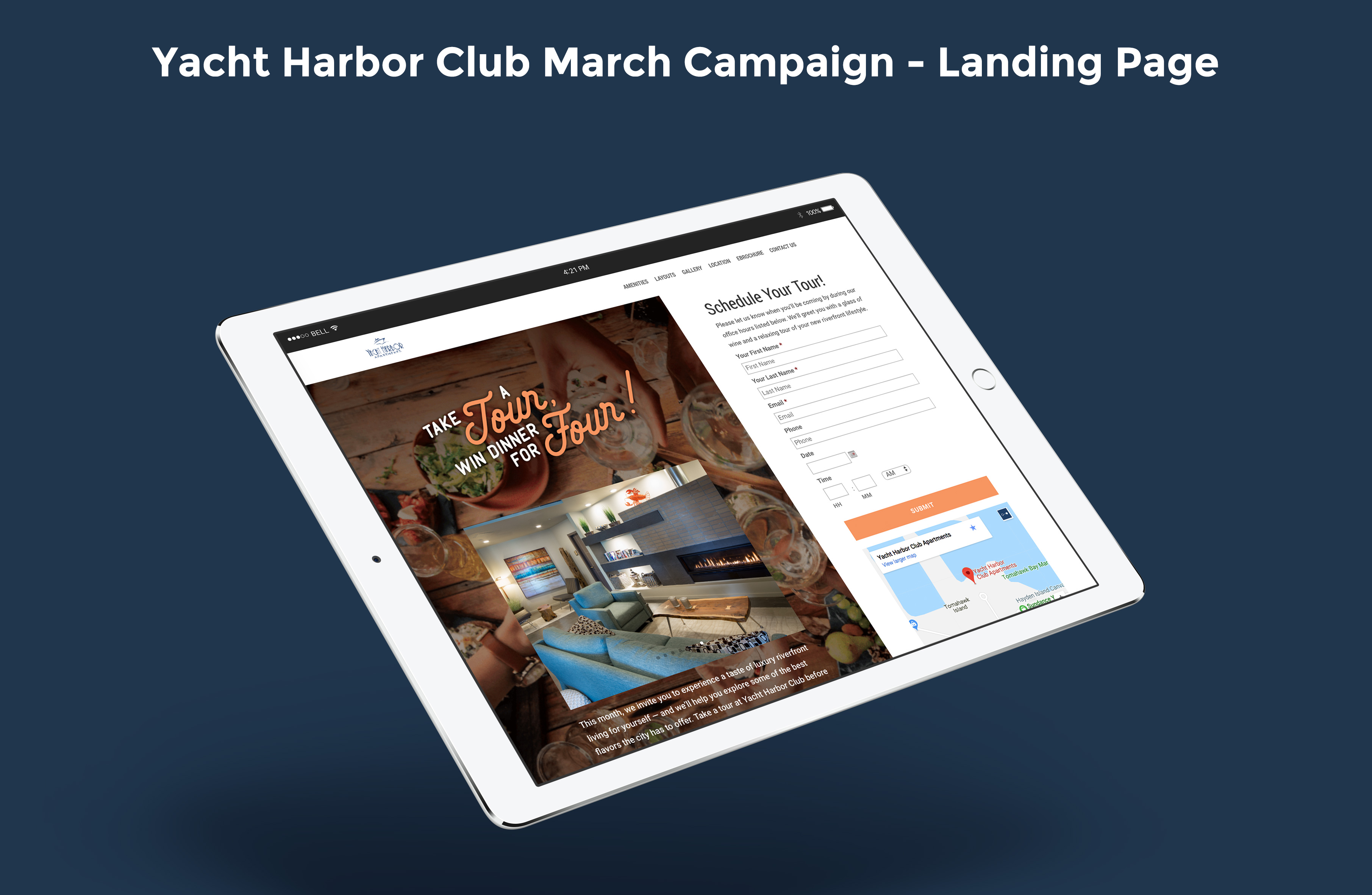
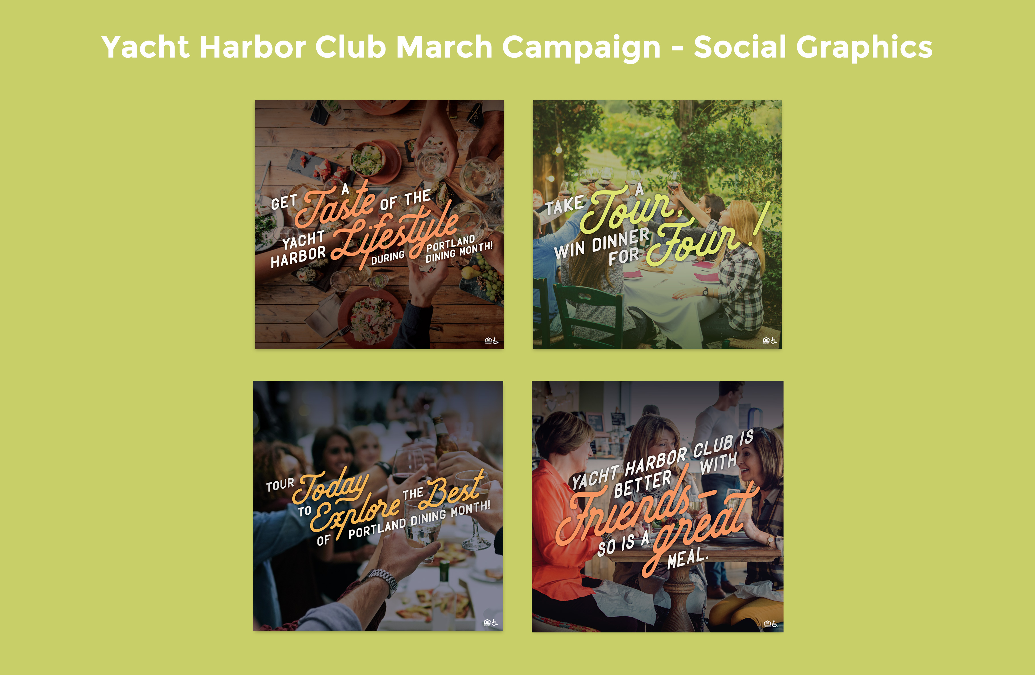
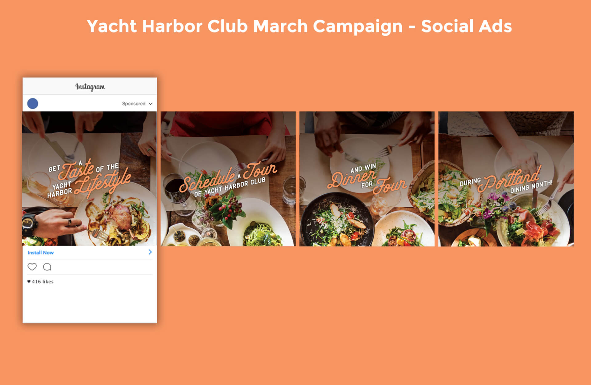

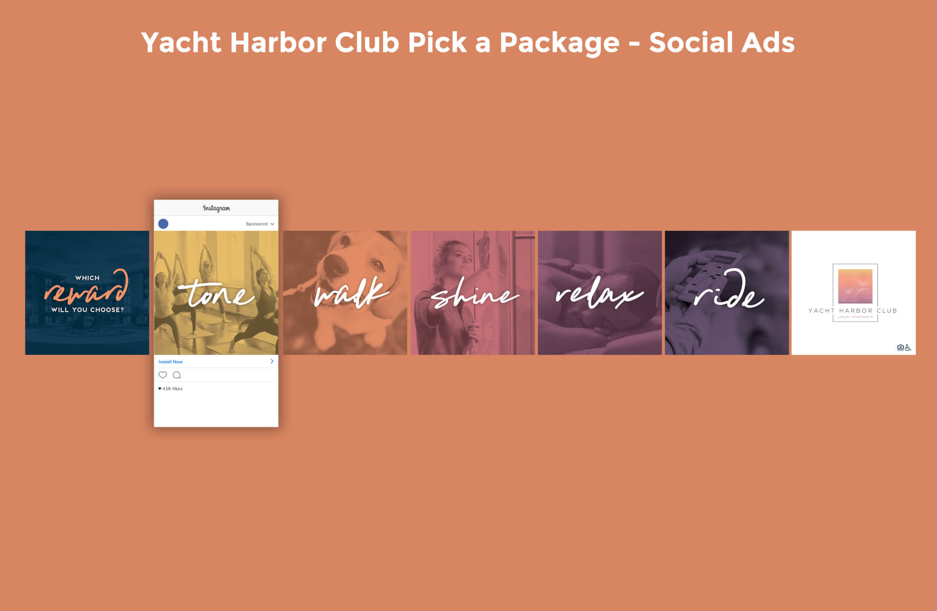
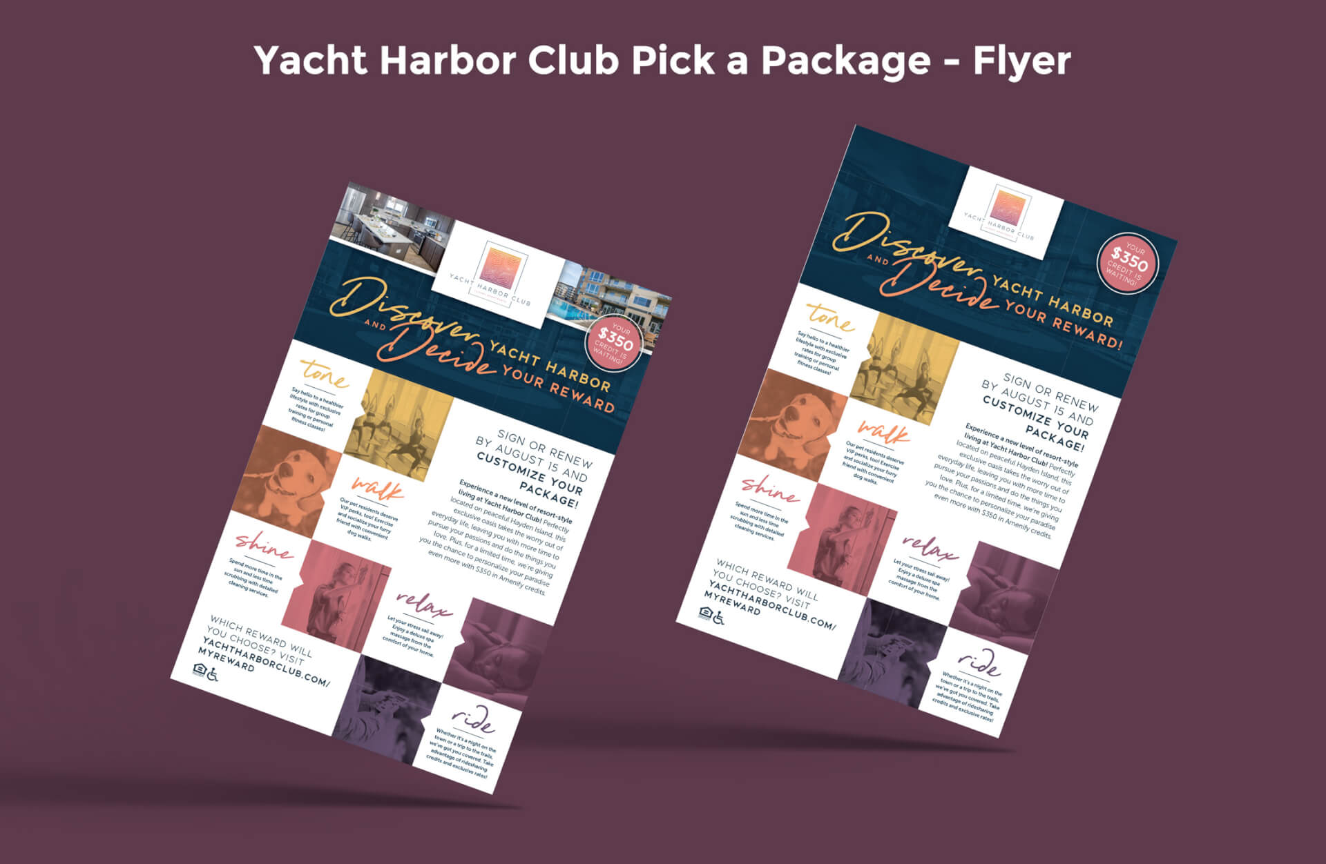
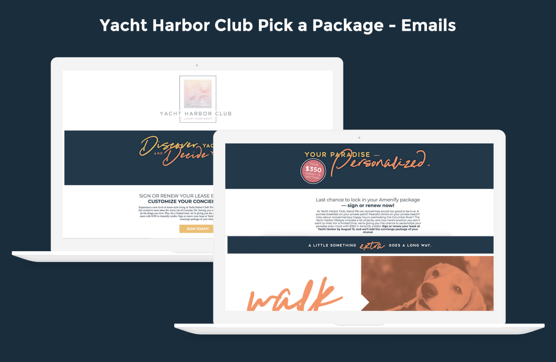
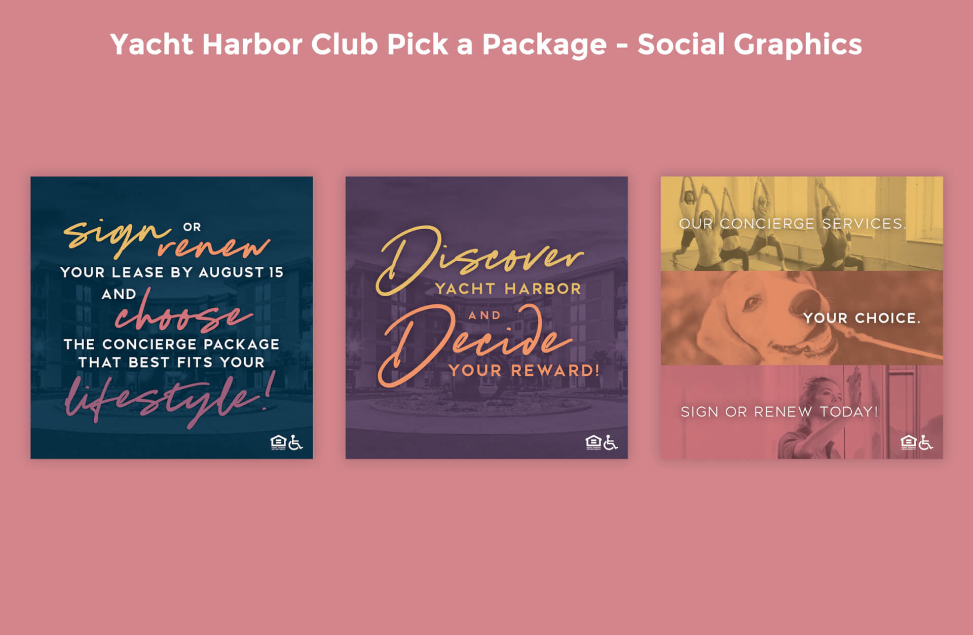
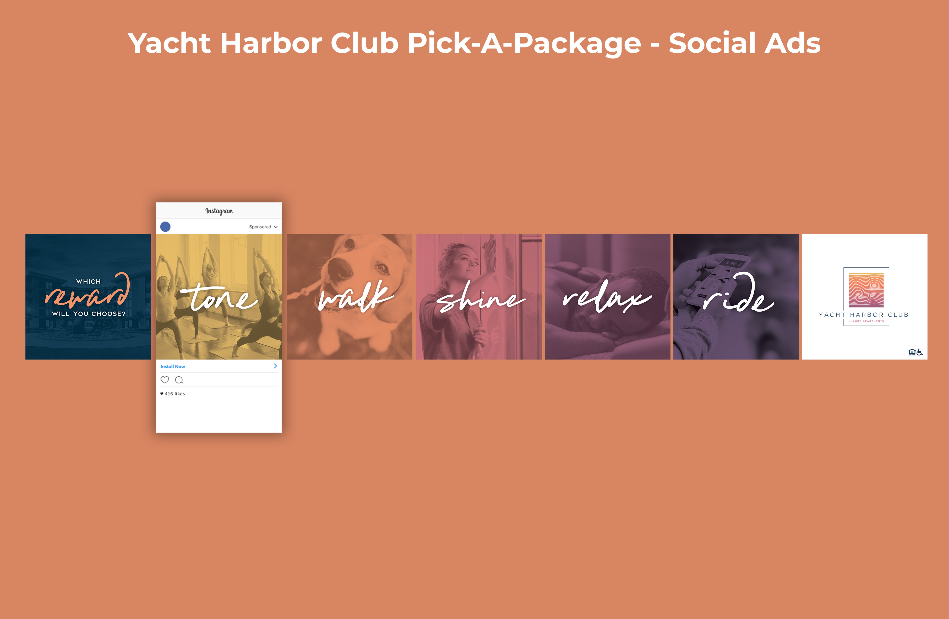
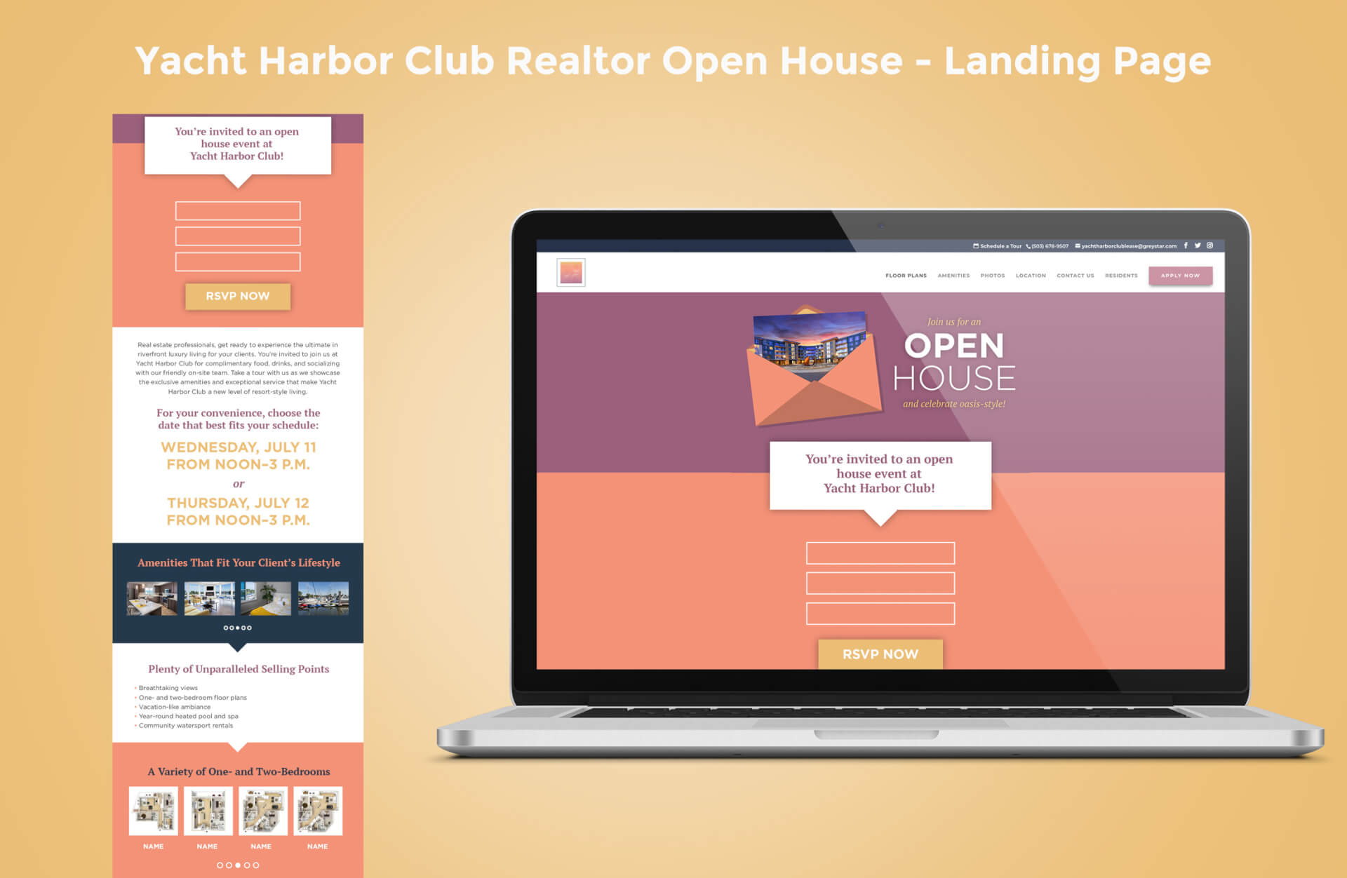
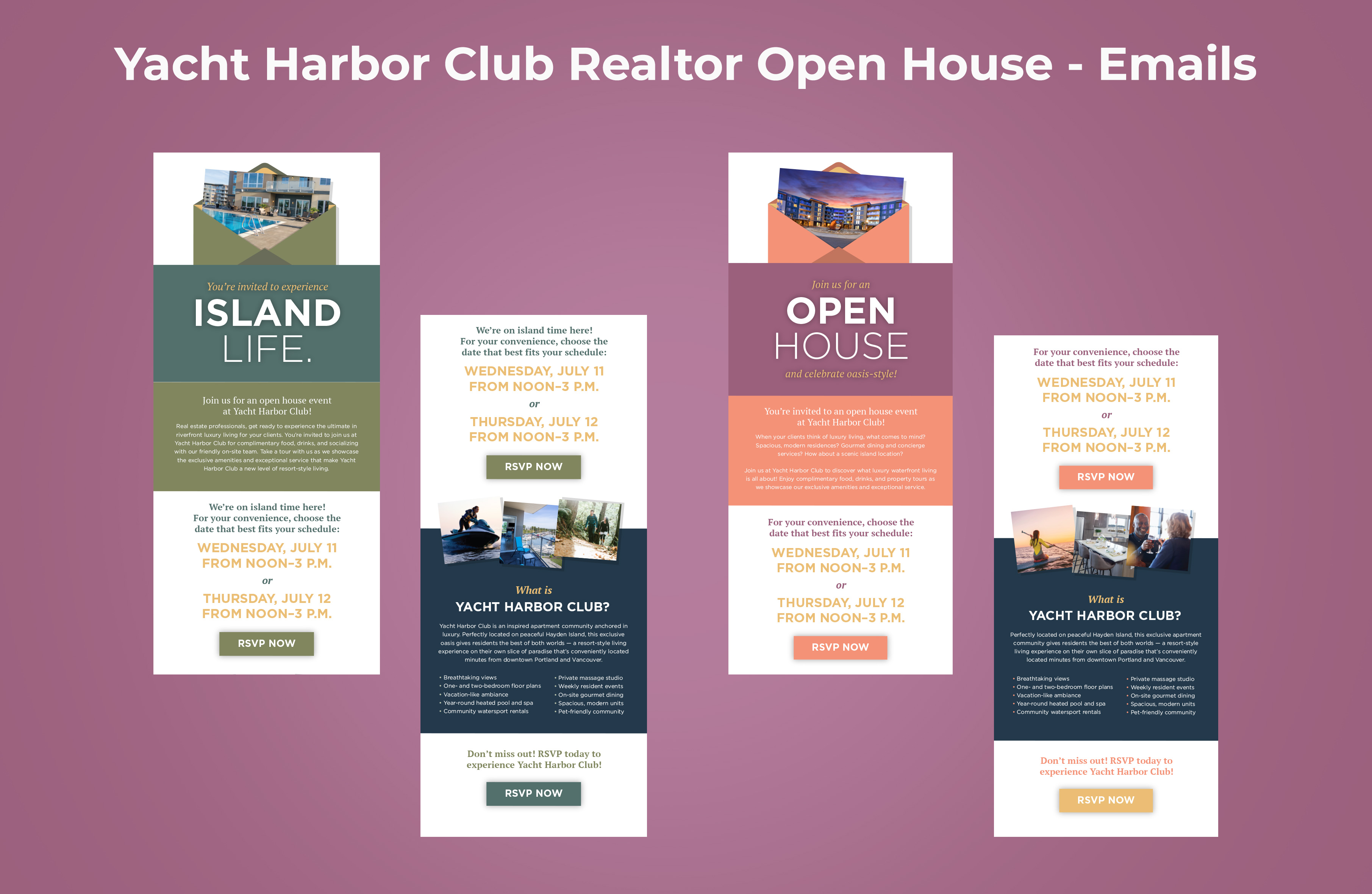
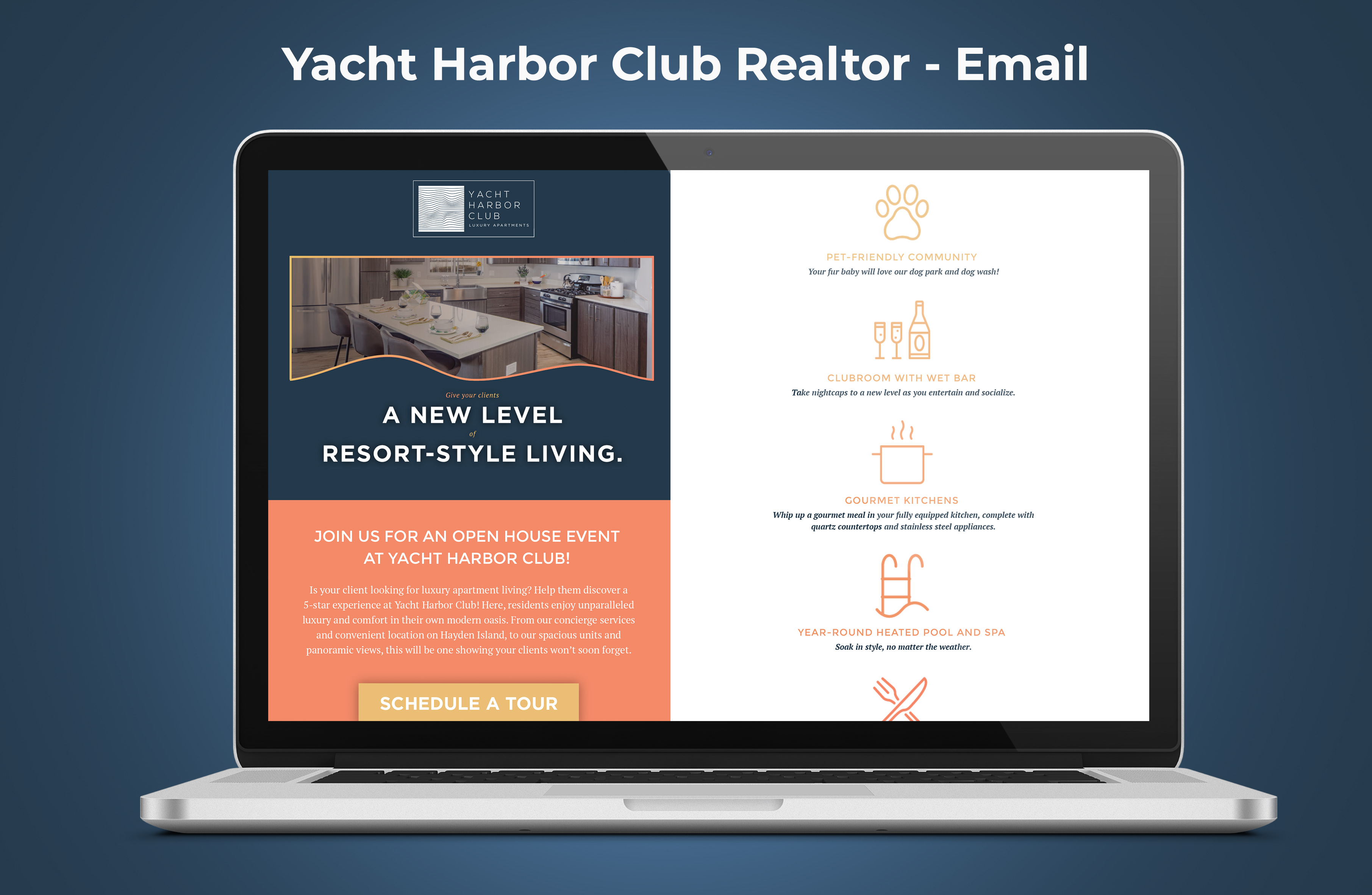
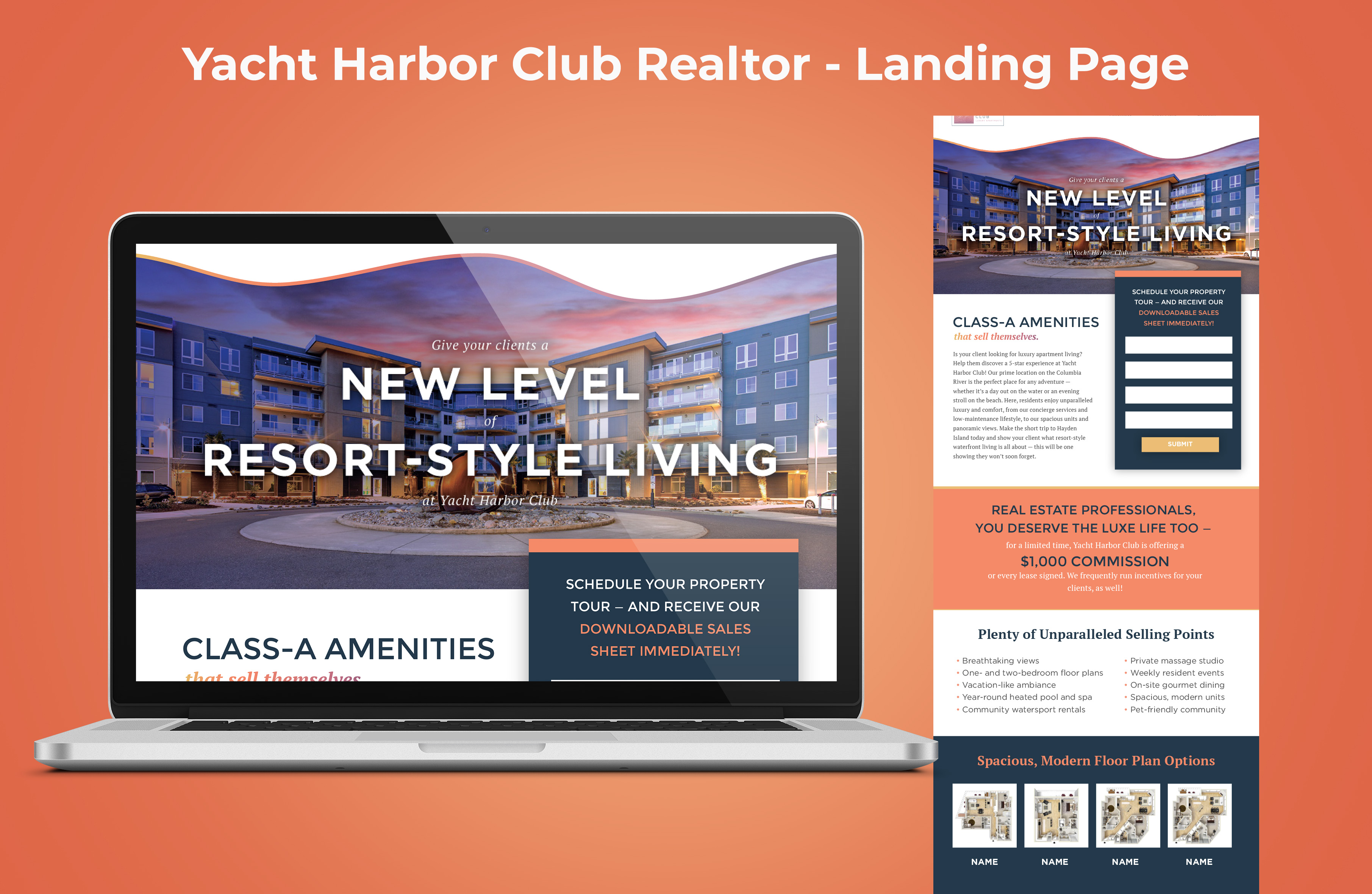


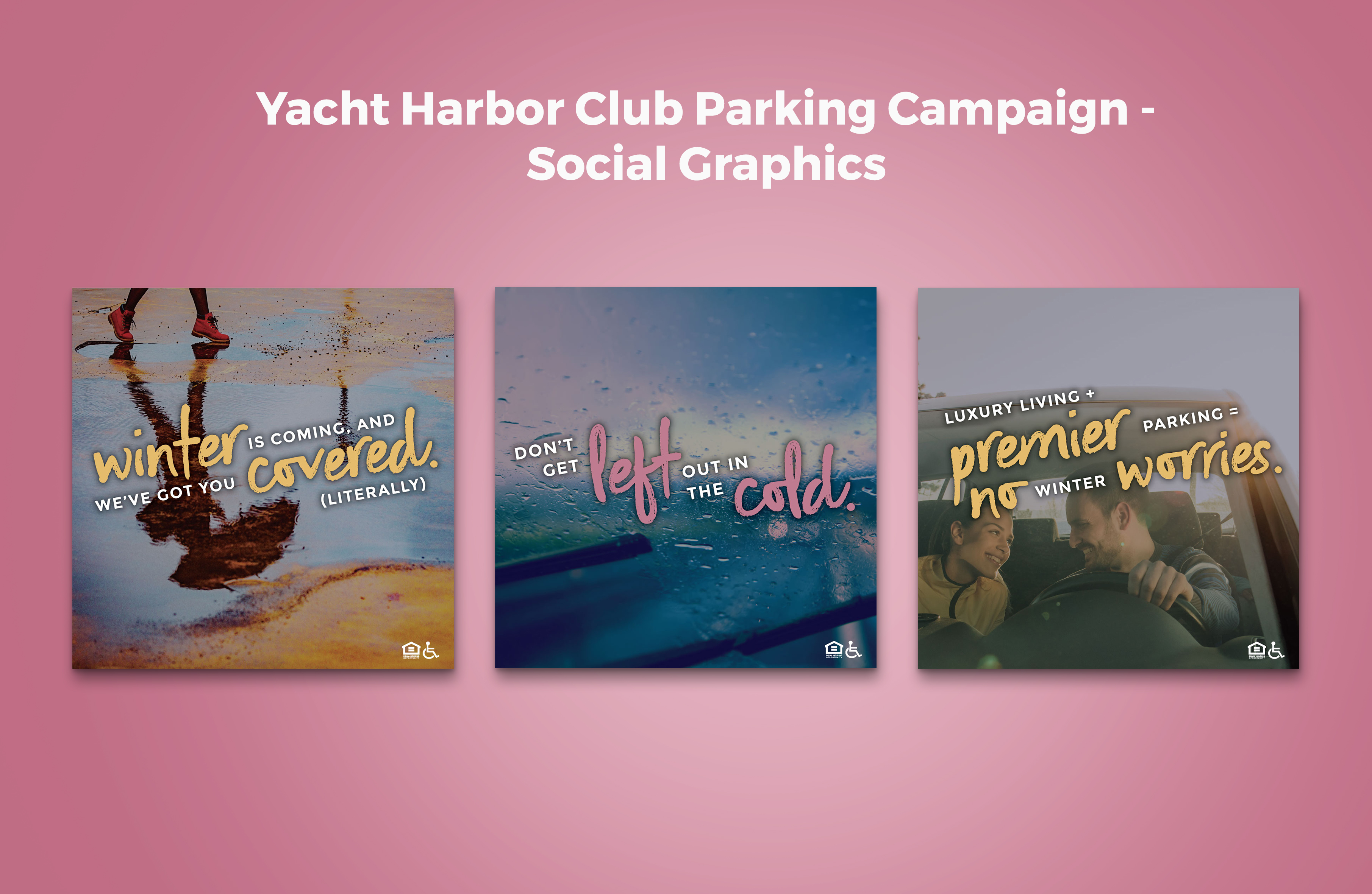
The Catalyst team continues to build traffic and results for Yacht Harbor Club through various monthly campaigns. Previous campaigns have included a tour incentive centered on the annual Portland Dining Month, open house events and email campaigns geared toward local realtors in Vancouver and Portland, a pick a package campaign that allowed prospects to customize their concierge services, and a free parking campaign that appealed to residents looking to escape the cold winter weather.
Through all of these efforts, Yacht Harbor Club has received a total of 509 total leads over a nine-month period and a total lease-up of 87.86% — a significant improvement from leasing at 55.49% prior to Catalyst rebranding the property.