

Google’s mobile-friendly algorithm update will hit on April 21, 2015.
Is your website ready?
In November 2014, Google released an update to mobile search results that labeled a website as mobile-friendly and released a new developer tool that would test a website for mobile-friendly design.
Now, Google has announced an update to the search algorithm that will force many webmasters to rethink their mobile strategy. On April 21, 2015, a website’s keyword rankings will drop for mobile devices if it is not categorized as mobile-friendly. More and more people use mobile devices (especially millennials), which means this could have a significant impact on all housing, especially student housing websites. If a prospect is looking for apartments on Google Maps, a poor mobile website could potentially harm their chances of showing up.
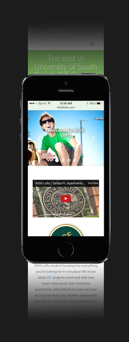
So what factors have an impact on mobile quality? Google hasn’t released a definitive list, but it’s pretty easy to assume from what Google recommends when a website is not mobile-friendly. For the purposes of this post, I’m going to use the website 4050lofts.com as an example, which Catalyst recently redesigned.
Here are three things to consider when designing for mobile devices:
1. Large text
Google wants to make sure content can be easily consumed. This means it needs to be large enough that the user can read it easily when they pull the website up on a mobile device. This doesn’t mean a website can’t have small text, but that the text must be proportional to the dimensions of the mobile website.
2. Large, separated links
Use large buttons to separate links and make them easy for users to click. Google doesn’t want links to be small and close together since this might lead to users clicking the wrong link. Always make sure that buttons have ample space on every side, and that the link itself includes more area than just the text. Use this for important links such as Contact Us, Schedule a Tour, or Lease Now.
3. Vertical scroll and zoom
The two recommendations above both fall under these two ideas: vertical scrolling and zooming. For the most part, if a user has to zoom in to see text or find a link, they need to be readjusted. Vertical scroll accomplishes this goal by ensuring text doesn’t get cut off or hidden. Without being able to scroll horizontally, a user can be led through a website without worrying about how to find specific information.
Things to remember
There are a few key points about this new update to remember. First, Google has explicitly recommended using responsive web design over a separate mobile website. This keeps your mobile and desktop content the same and increases indexing time since Google only has to crawl one page. Also, the mobile update will work on a page-to-page basis, meaning that the About page can be hard to view on a mobile device without affecting a mobile-friendly home page. If your website isn’t optimized for mobile devices yet, I’d recommend focusing on the home page for now. Last, Google has said the algorithm will update in real time. This means if a website has not been optimized for mobile by April 21, the drop in rankings can still be repaired with a new design.
With such a significant part of the population using mobile devices, it’s no wonder Google has taken such interest in providing users with a great mobile experience. This comes after many updates and tons of research from Google on user behavior and mobile use. The updates will likely continue, too. In fact, Google is currently testing a completely separate mobile index that will ignore desktop sites when displaying search results.
While these website changes are necessary for Google rankings, it is important to remember that the customer is first. Remember that optimizing for Google requires making sure that the customer gets exactly what they’re looking for when they arrive at your website. Implement these mobile changes with the customer in mind, and you can see higher engagement and continued rankings.