
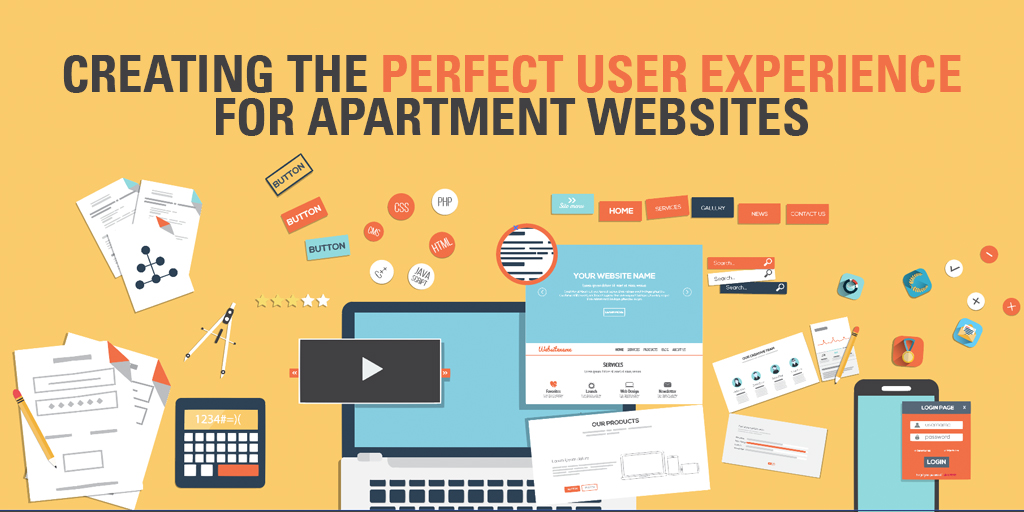
Every person on the web has encountered the same issue a million times before — you go to a website to learn more, but only get hit with more confusion than when you started. For apartments, this crucial moment can mean the difference between a lease and a competitor claiming the customer. At Catalyst, we’ve analyzed numerous apartment websites and designed our websites to be as conversion friendly as possible, pushing users to submit a form or sign a lease.
The Customer Path
In any industry, a customer’s online path has three stages:
- Lands on the website
- Finds the information they’re looking for
- Takes action for more information
User-experience optimization looks at making the transition between each of these phases as streamlined as possible. There are an infinite number of ways to do this, but a few simple tactics on an apartment’s website can make it much more user friendly and ultimately drive customers to convert more.
Minimize the Navigation
The navigation on apartment websites is the first place that customers are going to look for the information they need. For the majority of apartment websites, the three most popular pages are Floor Plans, Photos, and Amenities. These pages are the deciding factor for potential customers. By placing these links on the left side of the navigation, customers can find the information they are looking for more easily.
It is also important to clean up the navigation. Not every page needs to be included in the menu. For example, resident information can be included in a second menu at the bottom of the page. Ideally, limit your website navigation to seven links and eliminate drop-down menus entirely. This will focus customers on the parts of your website that will encourage them to contact you or sign a lease.
Set Up a Successful Home Page
This is the first interaction that customers will likely have with your apartments. There are three key elements to feature on the home page:
- Information about the property
- Highlighted amenities
- Links to internal content
When a customer arrives on your website, its purpose needs to be clear. This is a great place to insert SEO keywords, such as “The Best Apartments in Austin, TX”. A short statement like this helps the customer know they are in the right place.
How many amenities do you offer? Twenty? Thirty? More than likely, a customer will never read all of these. The home page is the perfect place to feature the top amenities that make your apartments unique. Use creative visuals such as images or icons to make these stand out.
Make sure the home page, like the navigation, drives users to those internal pages that they want to see. Include links to each of the important pages (floor plans, amenities, and photos) to continue driving customers there. In addition, the home page should encourage users to perform the final steps in the conversion process: contacting the property or signing a lease.
Utilize Call-to-Action Buttons
Buttons on a website are the key to driving customers to important pages. Make sure that buttons stand out (use bolded text, uppercase letters, and shadows), and use phrases such as “Contact Us!”, “Apply Now!”, or “Schedule a Tour”. These will direct customers to the places that you want them to go.
Ultimately, keeping in mind the customer experience on your website while you’re developing it will help you determine what you want users to focus their attention on. Keep your user experience streamlined to let users easily move through each step.