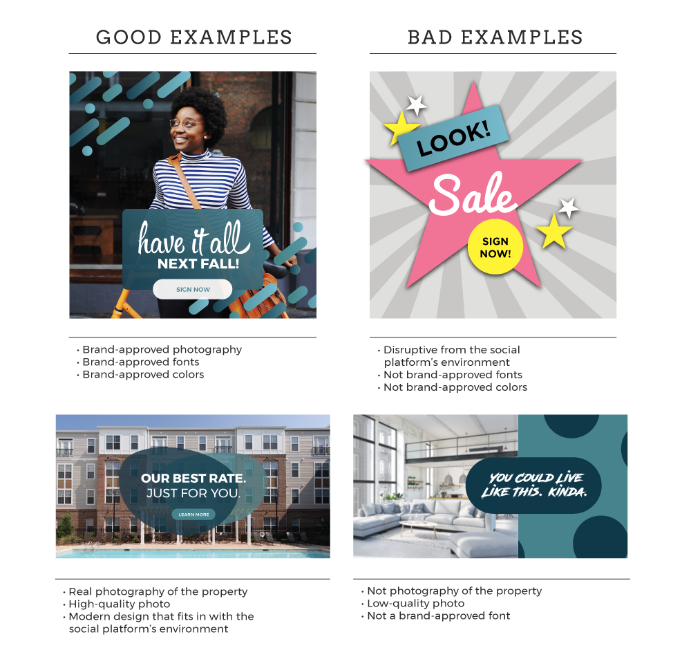
Creating an engaging ad on social media can be tricky. While you want your ad to stand out from the rest, there’s a fine line between eye catching and over the top.
Through my own experience as a graphic designer, and as someone searching in the market for an apartment of my own, I acknowledge there’s a certain look and feel one wants to get from their future residence. Most people tend to avoid ads that are visually overwhelming and look like they’d give you a million pop-ups once clicked.
By following your brand’s guidelines and maintaining a clear message, you can catch the eye of serious customers. Here are a few tips for creating an ad campaign that will get your prospects’ interest, respect, and clicks.
- True imagery is key.
- Make it high quality.
- Keep it simple and brief.
- Relate to a broader audience.
- Stay on brand.

1. True imagery is key.
The number one thing I look for in a property is good, honest property images. Personally, I won’t even bother looking further into a property if I can’t see what the bedrooms look like.
Utilizing honest images of your property will help build trust with your audience. Have you had CapEx done recently? Get professional photos taken and start using them in your ads. Not only do renovations show that you’re committed to improving your property, but you don’t want your leads to come and see something totally different than expected.
By exemplifying your property in its best and truest light, you’re assuring prospects that your property stands above the competition.
2. Make it high quality.
While it’s important to have true-to-life imagery, it’s also important to have high-quality imagery. Nothing will shut down a lead faster than poor-quality advertising.
Don’t get your on-site staff to take photos of the new model on their iPhone. Invest in your property and have a professional photographer take pictures you’d be proud to use in all your advertising needs. Allowing your audience to see that you’re willing to invest in the best representation of your property can go a long way.
3. Keep it simple and brief.
Don’t overwhelm your audience with flashy, cliché graphics. To maintain the interest of your viewers, give them a natural experience they normally look for on social media.
Use an appealing property or lifestyle image with a minimal, but on-brand, call to action. Let the imagery do most of the talking, and allow an enticing offer or caption to really draw in the leads. You shouldn’t interrupt the experience of your viewers. Instead, create something insta-inspiring, not nauseating.
4. Relate to a broader audience.
Although it’s important to market toward your property’s demographic, it’s never bad to cast your net a little wider every once in a while.
Get the attention of those who weren’t even searching for you. For example, create content that would interest any college student, not just the seniors or the students at the major university.
Look for ways to appeal to parents, underclassman, or junior college students. This helps build you brand awareness and potential word-of-mouth referrals.
5. Stay on brand.
The summer’s here, and you want to show off your great new specials. It can be tempting to use highlighter yellow and pink so your specials pop, but your property colors are navy and maroon.
Instead of ditching your brand and confusing your audience, use lighter shades of your color palette for your next ad set. By putting out work that doesn’t represent your brand, you risk losing leads that may have been keeping up with your property. To retain those that are interested in the brand, you have to offer and stay true to it.
All in all, take a step back and ask yourself, “If I saw this ad, would it make me sign a lease?” If the answer is no, consider the tips above as you try again. Create content that’s representative of your property and the level of service you give your prospects. As you begin to consider these elements of design and cater to your audience, the leads are sure to flow in.

