The Challenge
Catalyst was contracted to create a modern, custom website for Landmark Grandview that stood out in the San Antonio, Texas, multifamily housing market. Prior to Catalyst’s relationship with the client, the original website was outdated, dark, not inviting, and didn’t organize information clearly for visitors. The new comprehensive website needed to generate appeal and encourage tours, visits, and online leases. In addition, Landmark Grandview had multiple floor plan files that needed to be showcased in an organized way.
The Solution
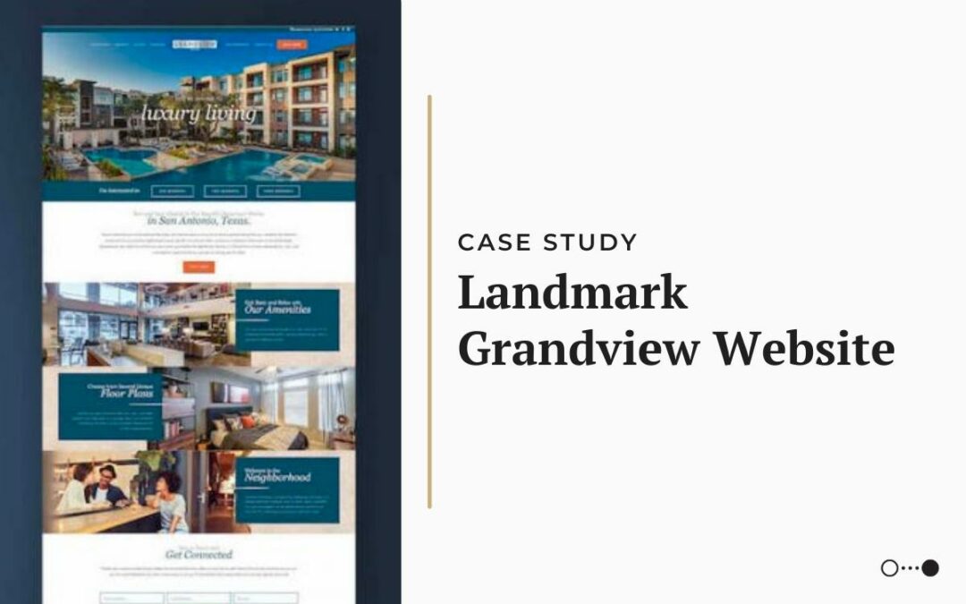
After completing an initial brand guide for the property, Catalyst provided Landmark Grandview with a website mockup for approval before moving into design implementation. The main objective for the website was to convey the same look and feel that the property offered in person. By utilizing large professional images that filled the viewer’s screen, a sense of luxury living was established immediately. The rest of the homepage then drew inspiration from the property’s interior palette and textures, creating a streamlined look throughout the page. Other key features included a mosaic-style image gallery, interactive hover features, and expandable amenity sections.
One big challenge for the Landmark Grandview website was finding a way to incorporate three different renderings for each floor plan option — a 2D image, a 3D image, and a 3D furnished image. Catalyst compiled all this information into easy-to-use lightboxes that allowed visitors to easily rotate through the options on one screen.
The Results
Catalyst successfully launched the website in fall 2018, which immediately positioned the property as a standout first impression to online visitors. The easy-to-use custom site represented the brand more completely and accurately as an inviting community to call home.

