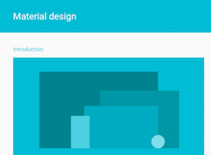
What Is Material Design?
Material is a form of design that many marketers have begun to embrace in recent years because of its simplicity and effectiveness. The design uses specific tactics that help users understand content better through rules that imitate the rules of physics in the real world.
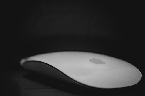
If you drop your mouse on the ground, it’s not going to fall at a consistent speed. It’s going to start slow and accelerate (quickly) until it smashes into the ground and breaks. This is an inherent part of life that we all understand. Material embraces concepts like this with rules for motion that mimic acceleration and deceleration as movement is starting or stopping.
While all of these elements aren’t required, most material design includes:
- Flat design
- A focus on minimalism
- Use of color, 3-D space (shadows), and motion
- Interactive elements
- Consistency across devices
The popularity of material design has increased significantly in recent years as more and more companies have begun to jump onboard. Recently, Google released a full set of material design guidelines for its Android developers that goes through every aspect of material, from animation to usability. In it, Google outlines two goals for material websites:
- Create a visual language that synthesizes classic principles of good design with the innovation and possibility of technology and science.
- Develop a single underlying system that allows for a unified experience across platforms and device sizes.
This is why material design is so effective — it marries the principles of design and technology to give users a system they will understand, no matter where they are.
How Material Design Improves Online Marketing for Apartments
We see a lot of apartment websites that have a number of issues with their online usability. In today’s world, having a website that’s user friendly is a crucial aspect to any business, especially apartments.
| What We See | How Material Design Fixes It |
| Old, outdated designs | Simplistic and modern design |
| Cluttered website content | Structure focused on high-performance pages |
| Missing correlation between user intent and website focus | Use of color, 3-D space, and motion to direct users’ attention |
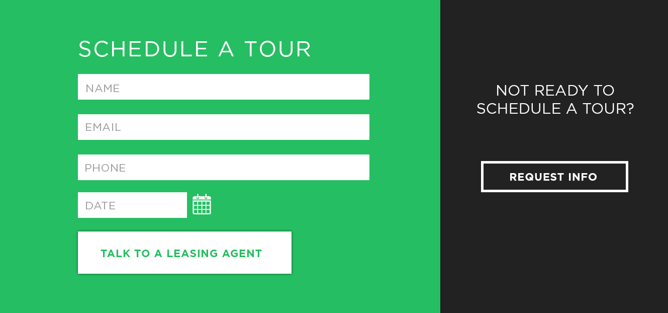
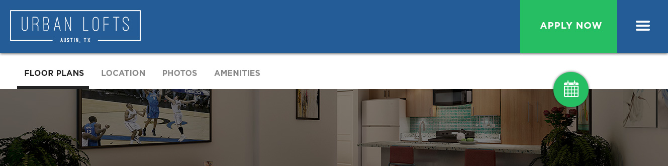
For this example, we’re going to assume that there is an apartment complex in Austin called “Urban Lofts”. Urban Lofts has very upscale, modern apartments. Their brand colors are blue and green with a much brighter green than blue. The leasing team at Urban Lofts thinks that they can get people to sign if they would just come in for a tour. This page is centered on just that — giving users the reason and opportunity to schedule a tour.

Click to enlarge.
The Navigation
First, the navigation puts the main conversion pages in a minimal menu on the left side to focus users’ attention on these. All other pages are underneath the menu button on the right. Second, the application button and the Schedule a Tour icon both use that green background color so that they stand out.
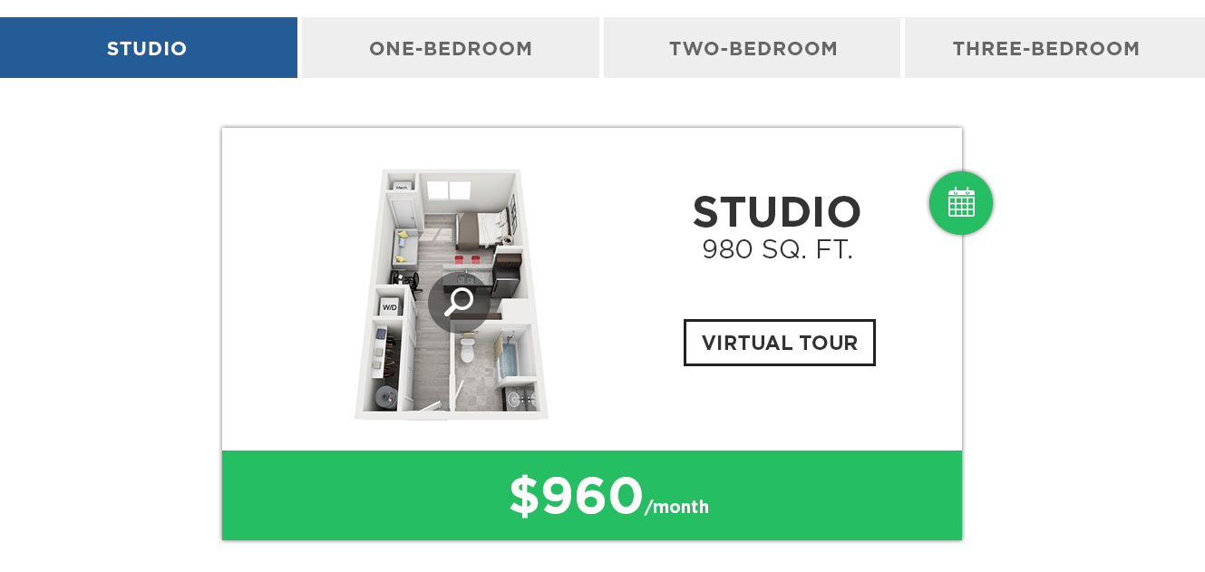
The Floor Plans
The actual floor plans section lets users immediately choose their experience by picking one of the floor plan buttons. The active button is highlighted by the secondary, blue background so that users know what they are looking at. The floor plan “card” itself appears lifted off the ground with the drop shadow behind it, and the main focus is the price. However, it also employs some other interactive elements if users want to engage with the content. Again, the Schedule a Tour icon uses the green background to stand out from the rest of the content.
Icons and Paragraph
These icons give a really quick glimpse into what a prospect would get if they signed a lease. The simplicity of these allows users to skim through the section if they don’t want to read the entire paragraph. And since these icons aren’t as much of a conversion-oriented element, they simply use the blue background.
Call to Action
Since this is a conversion-oriented page, having a form directly embedded here allows conversions to be instantaneous. This section uses more of the green color than anywhere else on the page to make sure that users are immediately focused on it. The button at the bottom of the section uses a shadow to stand out from the rest of the content, as well.